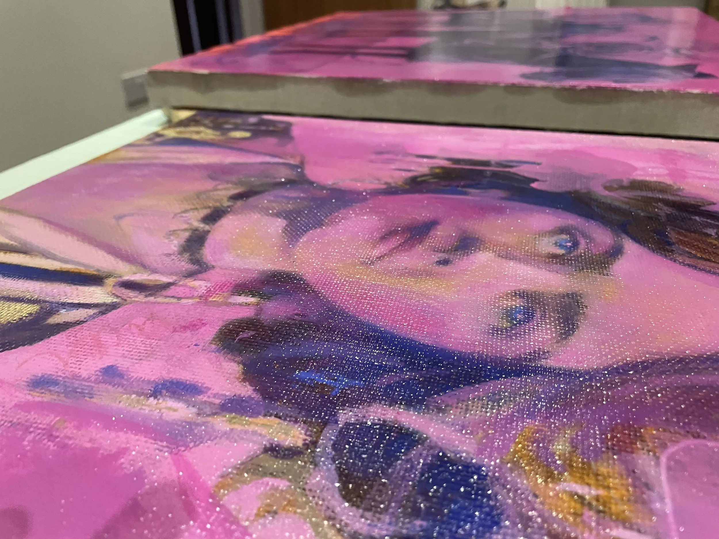
Evolution of a Painting #4
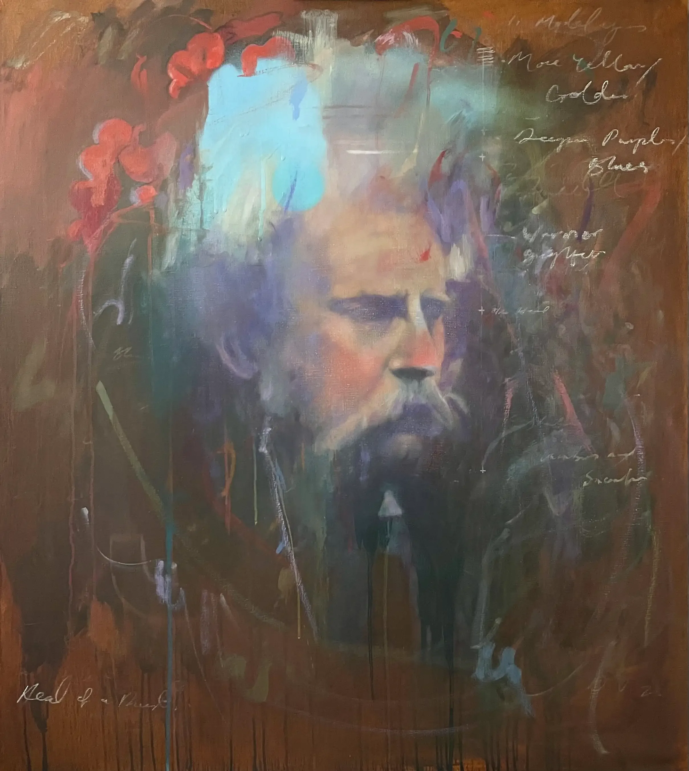
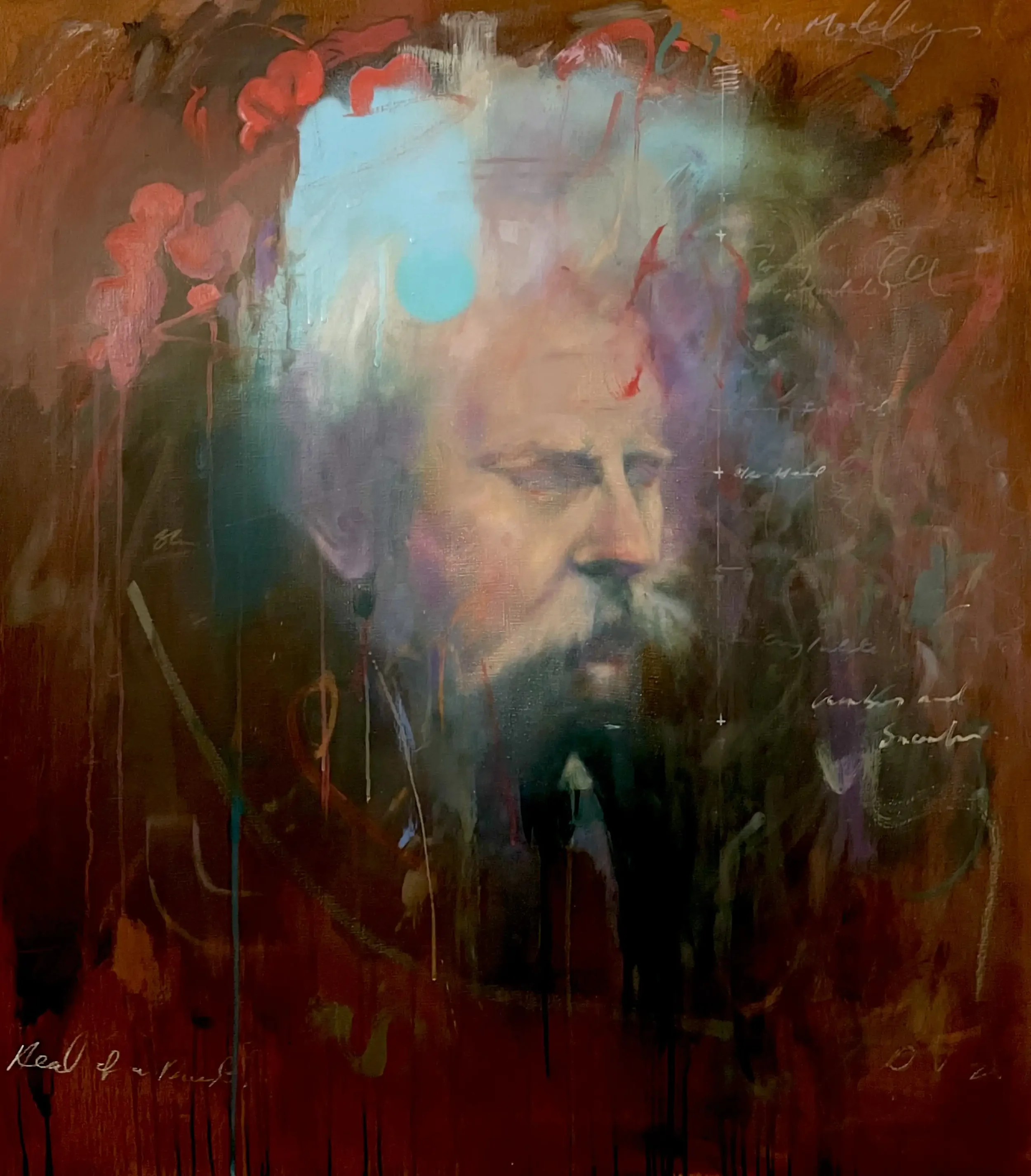
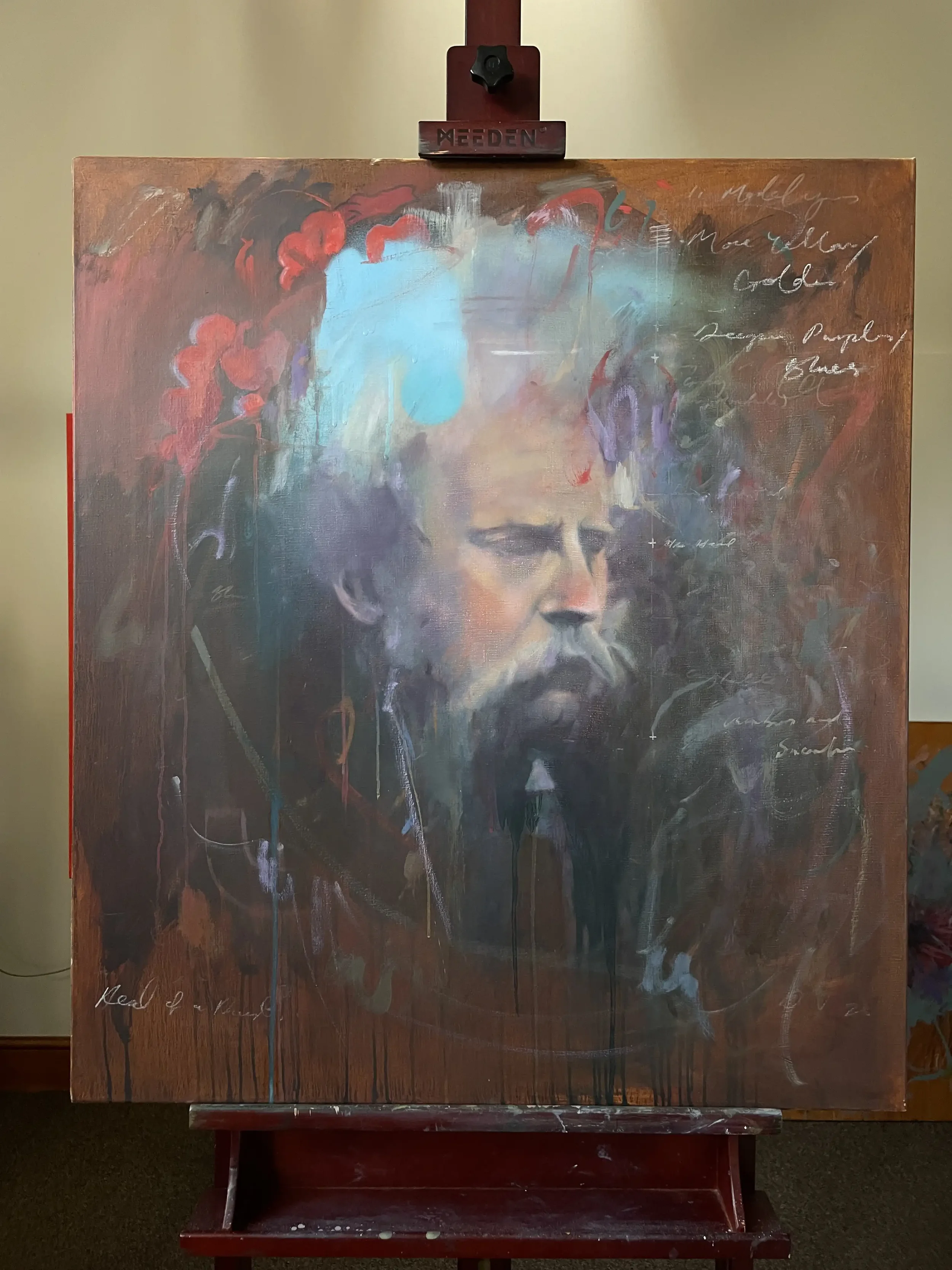
Head of a Priest (2025) I Oil and Mixed Media on Linen
A painting I began in 2023, intermittently working on in 24 then finishing and selling in 2025.
It was really my first decent attempt at conveying a sense of depth, memory and transience that would form my rationale behind ‘The Visitors’ series.
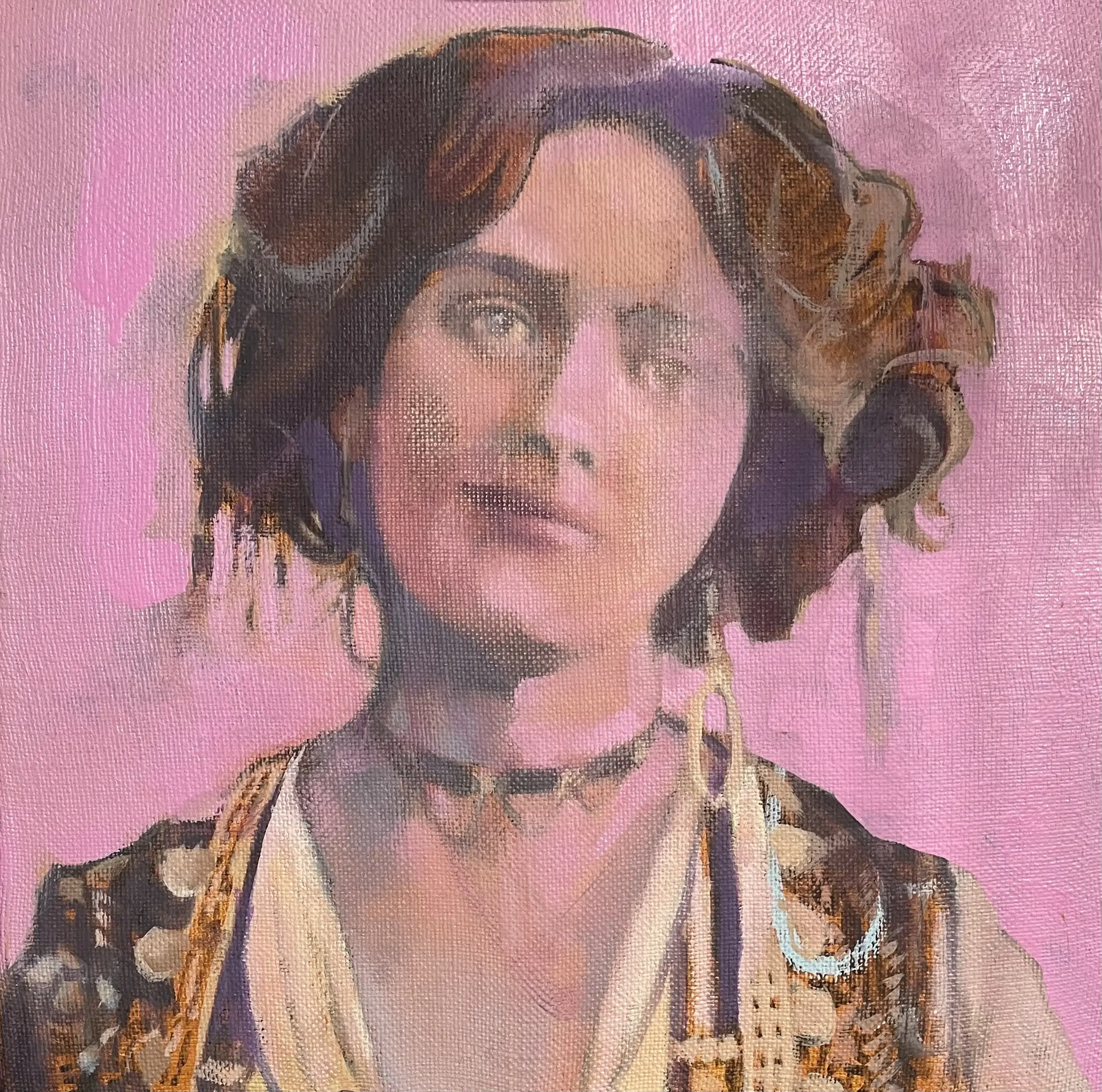
2023
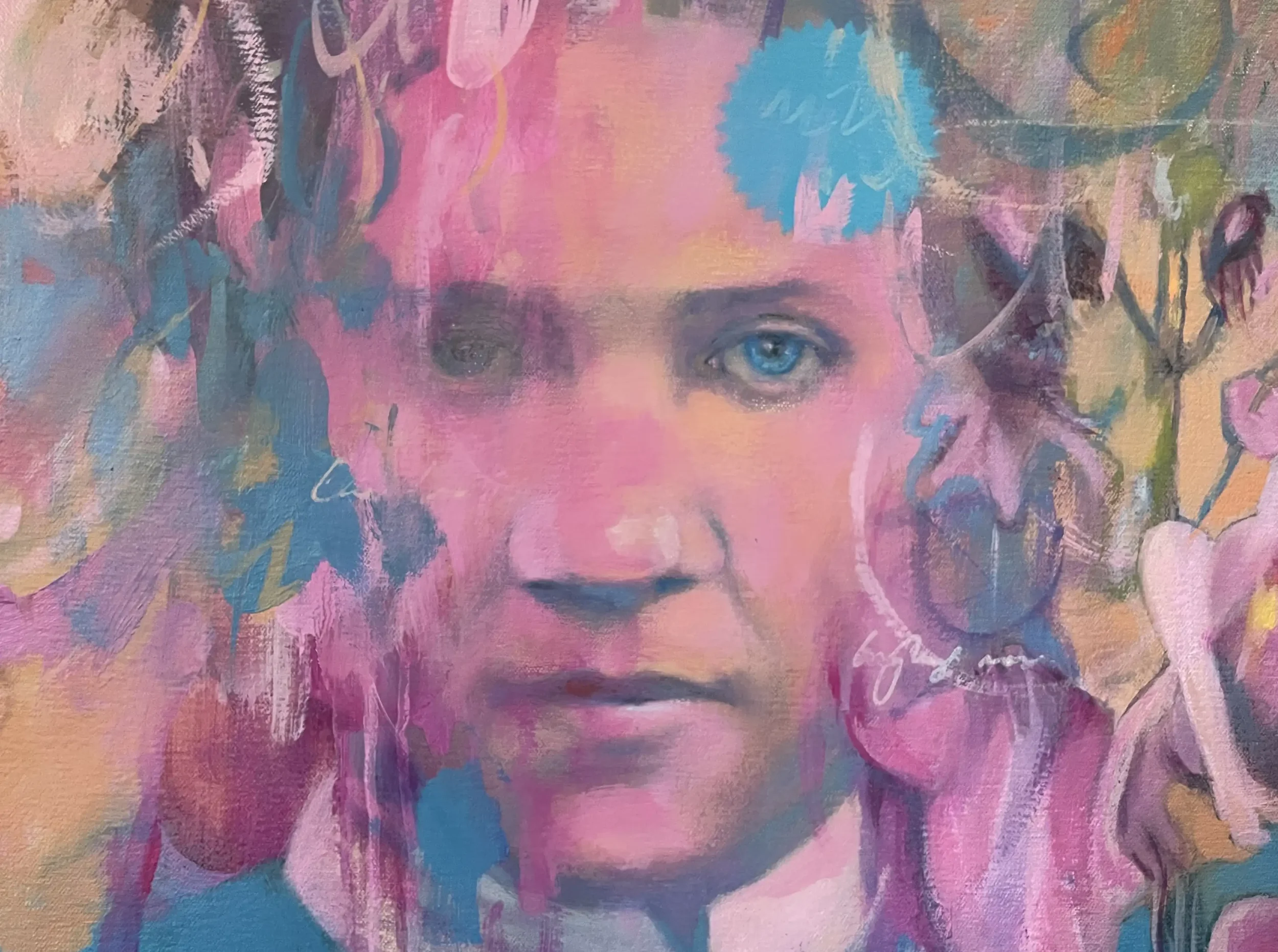
I had a spare bit of linen kicking around and it was a good starting point to paint a head study. Linen is such a beautiful, smooth and taut surface to paint on, exquisite really.
I’ve always been fascinated by the Dutch masters particularly Franz Hals who I was privileged enough to see at the National Gallery in late 2023. Hals, like Rembrandt and others, has this great sense of the sitter emerging out of their background. Now, I’m no master but I thought it a worthwhile exercise in attempting my own version but with a DJ twist.
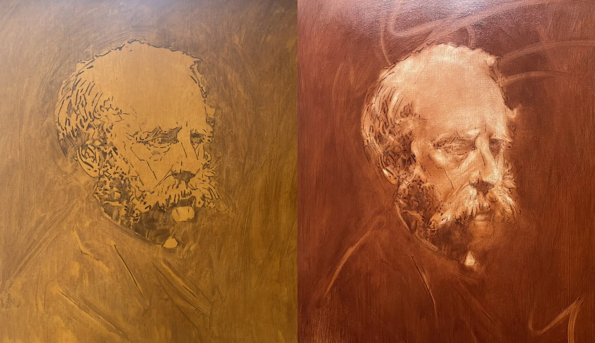
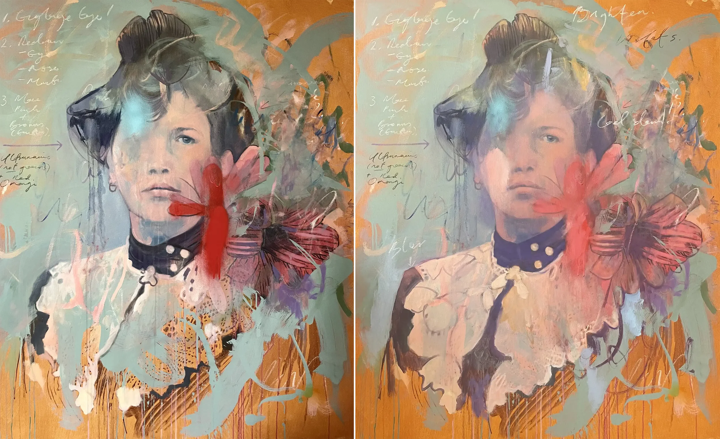
Having prepped the 76 x 86cm canvas in April 23, I started with some earth colours as a base layer before drawing the head. After a darker umber ‘scumble’ was applied, I worked a rag into the surface, removing areas of mid and light tones.
Throughout May to October 23, I’d do intermittent bursts of activity not entirely convinced by the colours I was applying or where I intended to go with it.
Painting portraiture doesn’t come naturally to me as it does with others and I’m always a little confused about which direction I should settle into - realistic flesh tones or alternative palettes of violet and blues? Anyway, I added in florals, my ubiquitous notations and attempted to add texture and depth into it.
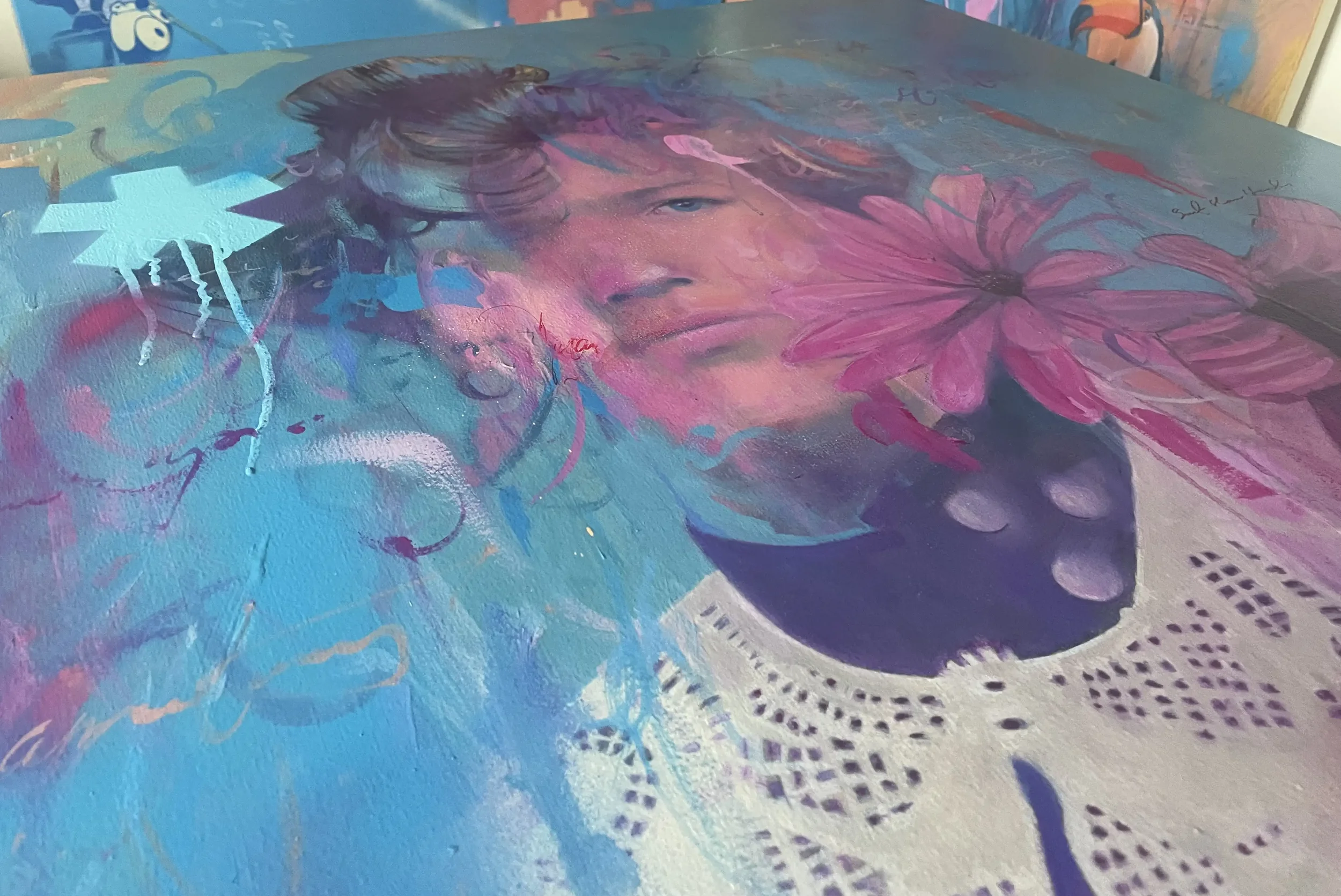
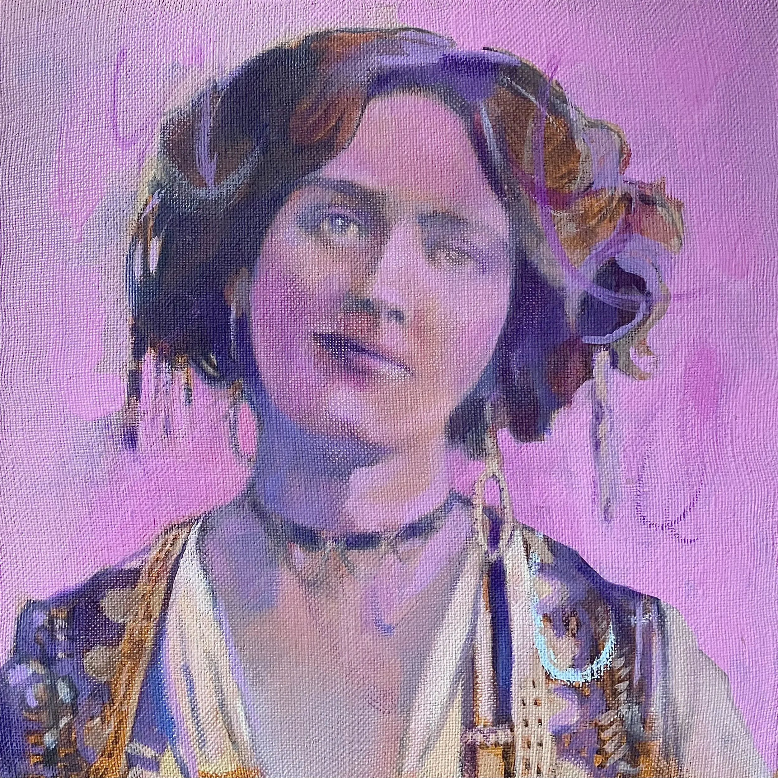
2025
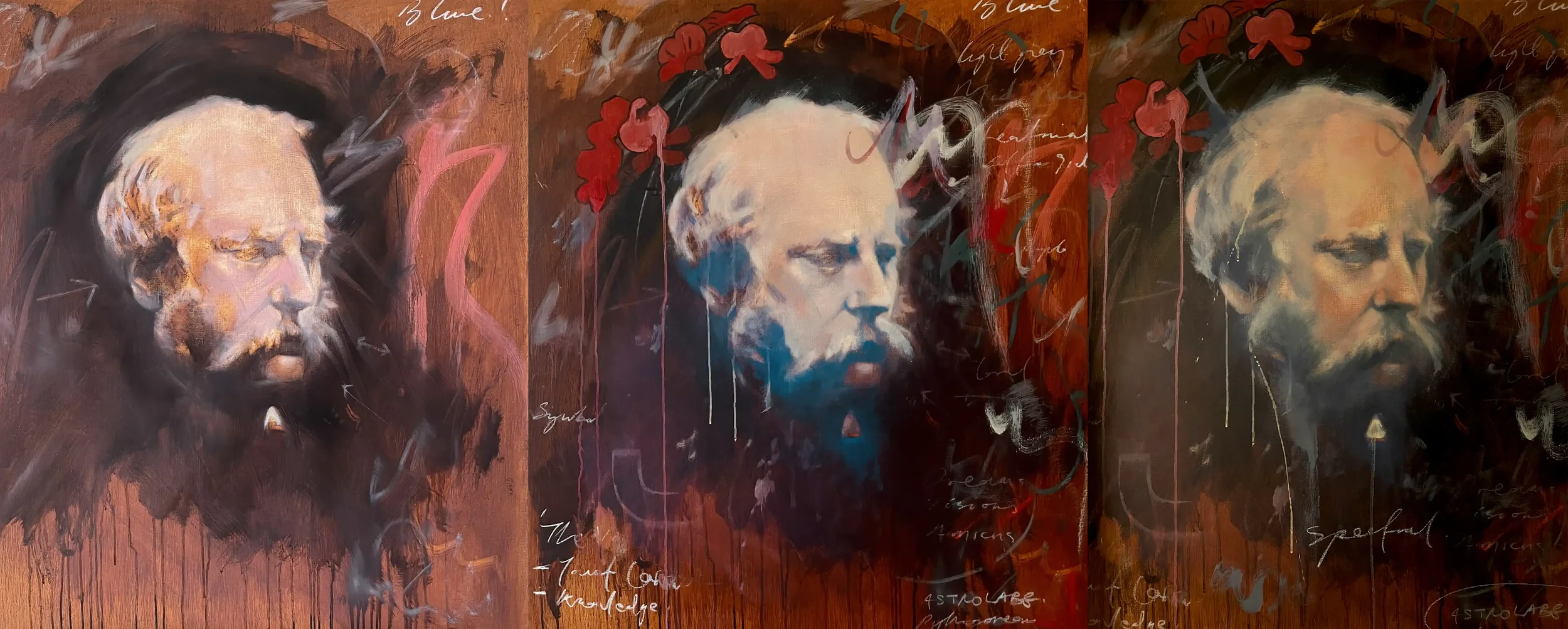
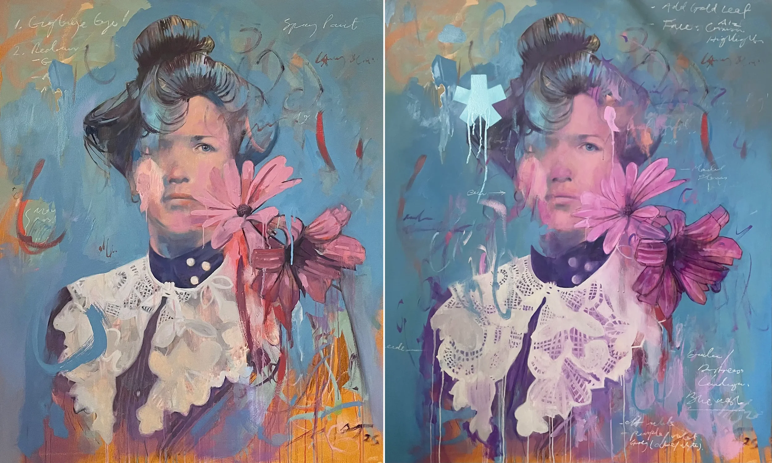
Into mid 2025 and I’d added in areas of baby blue spray paint and stencilled in graphical elements. It certainly felt more liberating. I also like a painting to have surface, areas of visual intrigue - this harks back to my textile days and the notion of texture and manipulation, hence the spray drips.
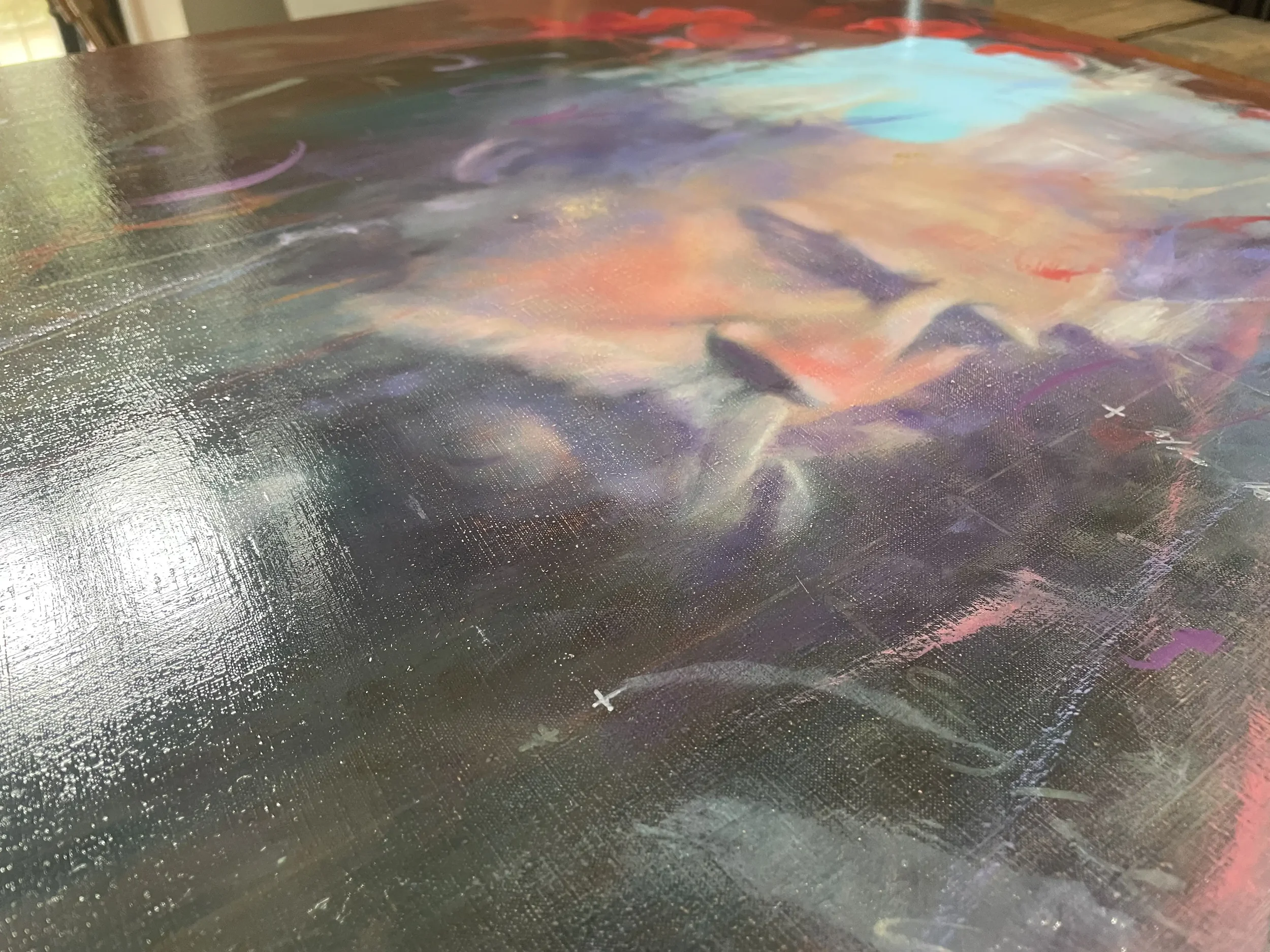
It’s important, especially on linen and its beautifully fine weft and warp, to leave some of the texture of the fabric exposed. Above, you can see that I haven’t went full pelt applying thick paint. On the contrary, I kept the paint layer thin (though this is more likely due to my inherent caution and embryonic skill).
I was still unconvinced of its direction though I did want it to feel spectral, otherworldly. The reference I was using had very little to go on around the eyes in particular so I’d have to be pretty judicious and keep it ambiguous.
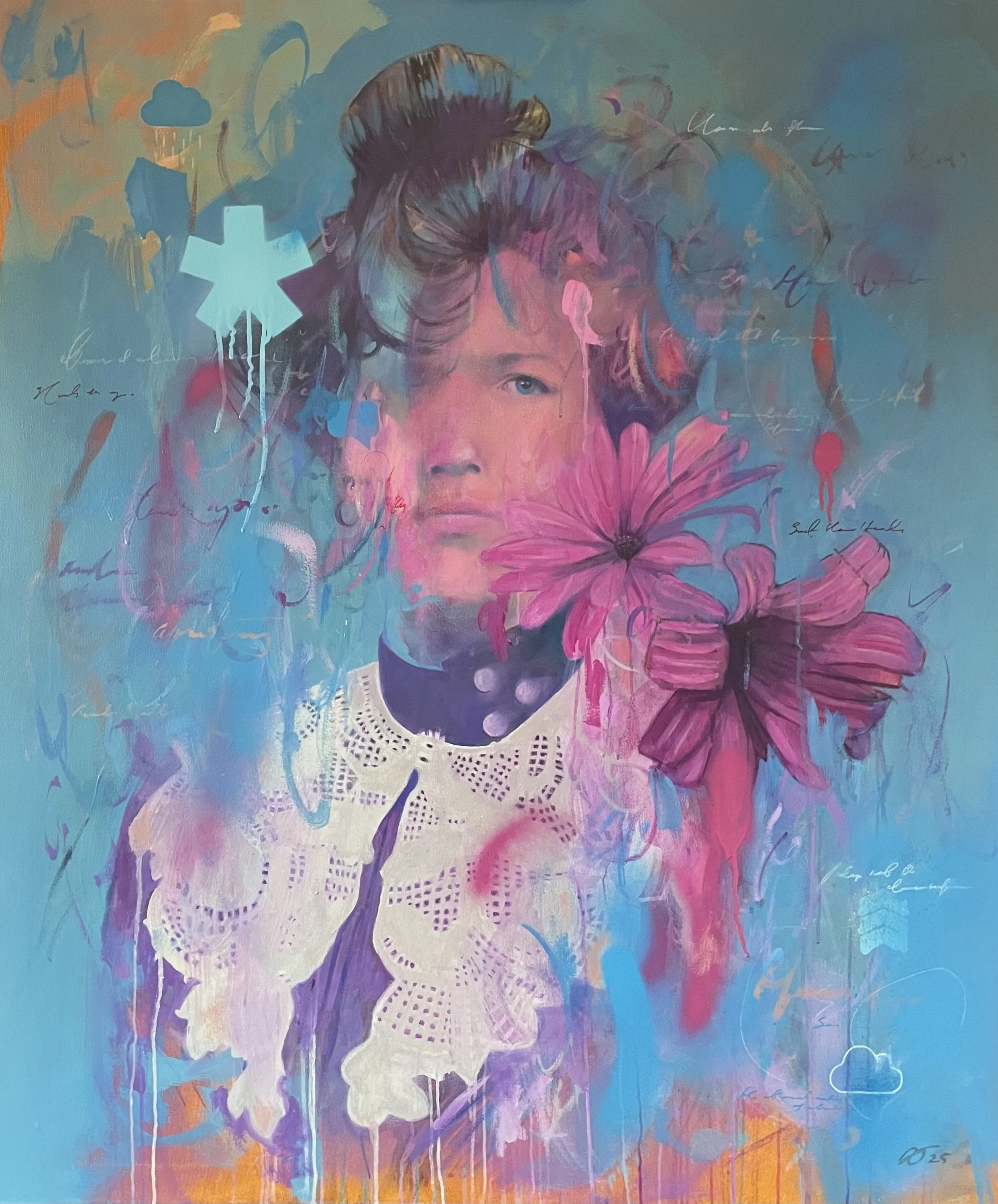
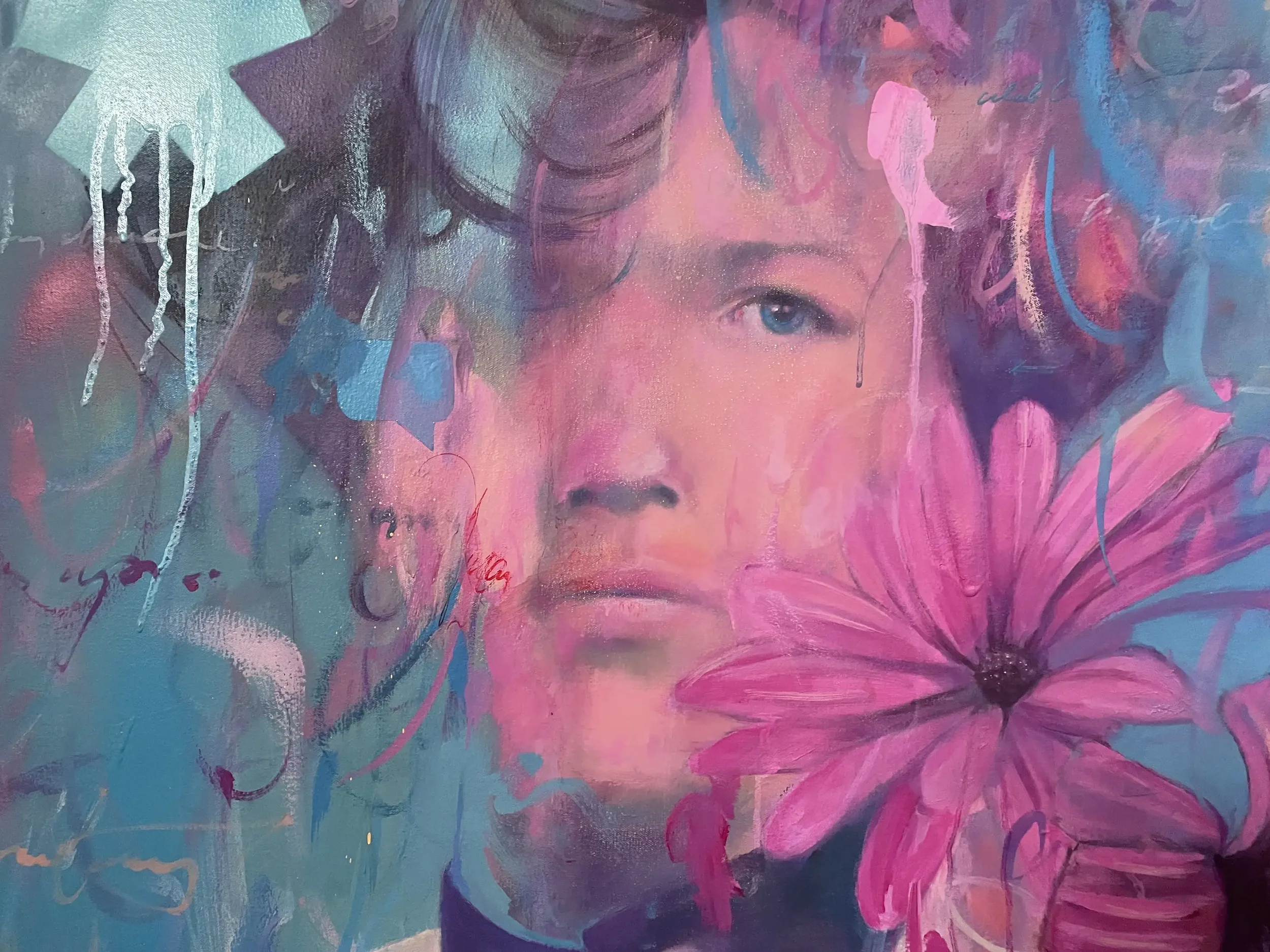
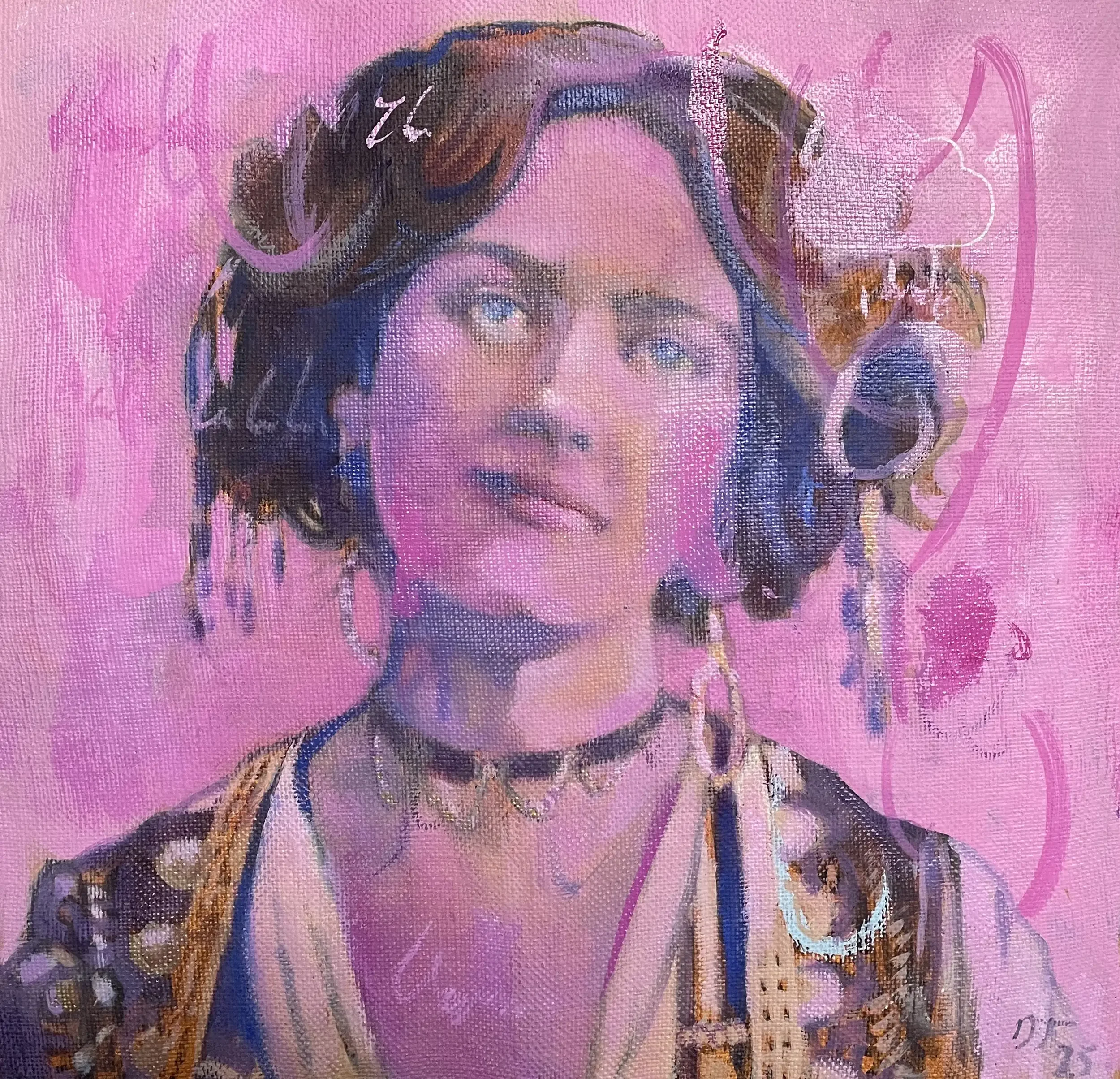
Working and reworking tentatively - and with an impending deadline of mid August for its sale and pick-up - I tidied up areas, applied a little gold leaf, removed some chalk writing, then applied a layer of satin Ganvar varnish to the final, finished piece.
The buyer was very happy though I’m unconvinced by the length of time it took and a little annoyed at my timidity throughout the painting. Still, done and dusted and a nice learning exercise.

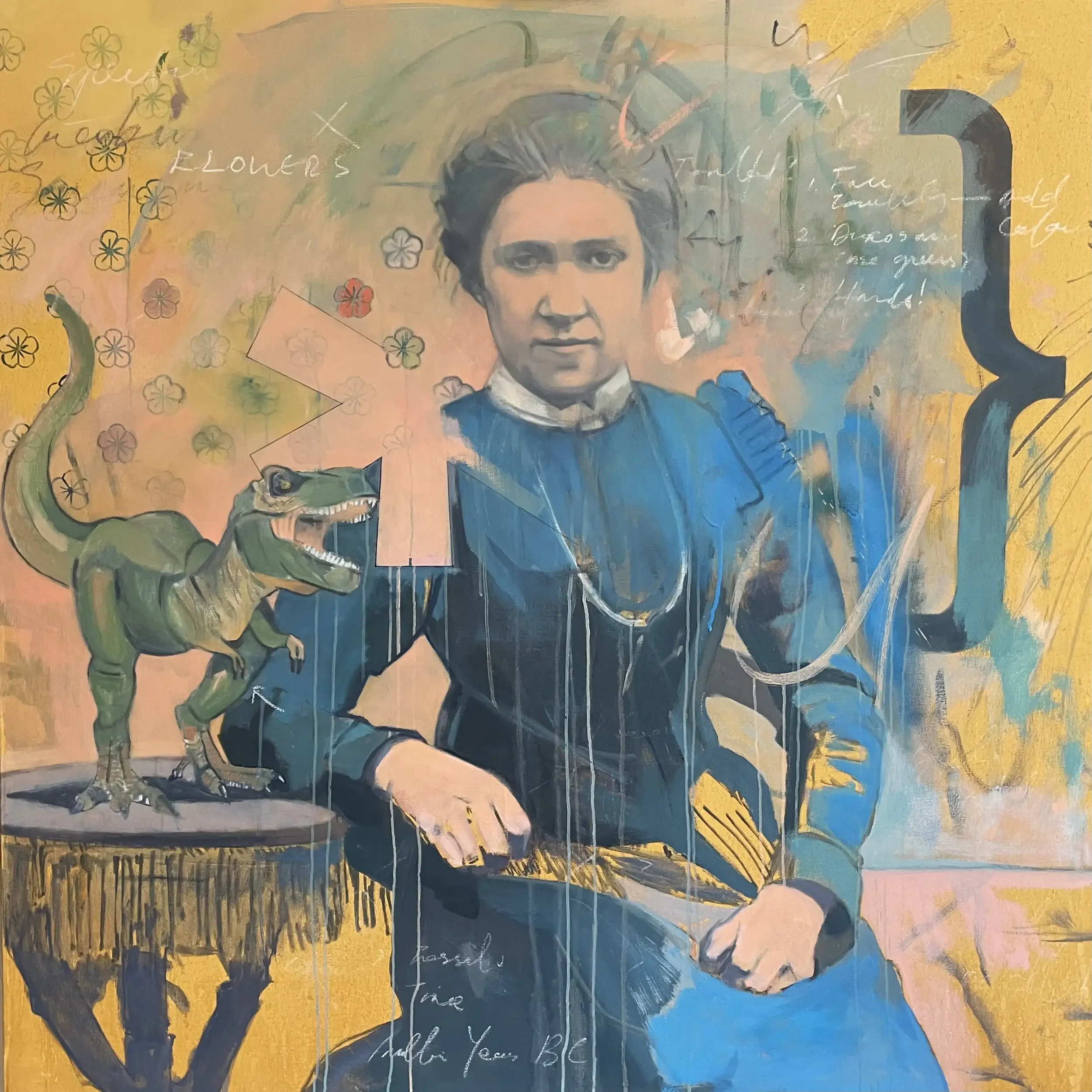
Evolution of a Painting #3
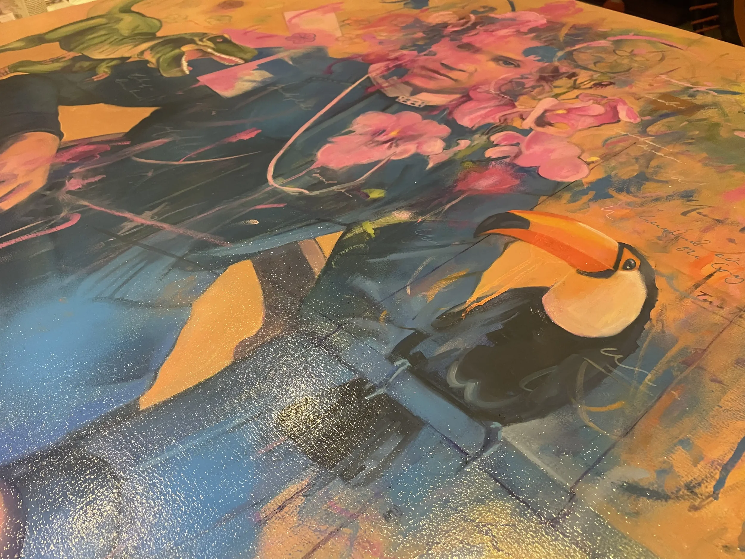
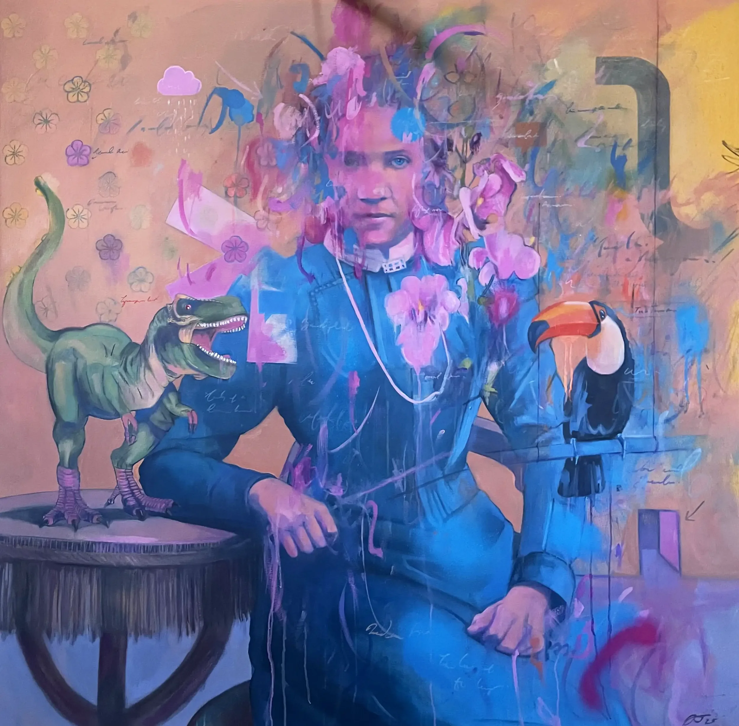
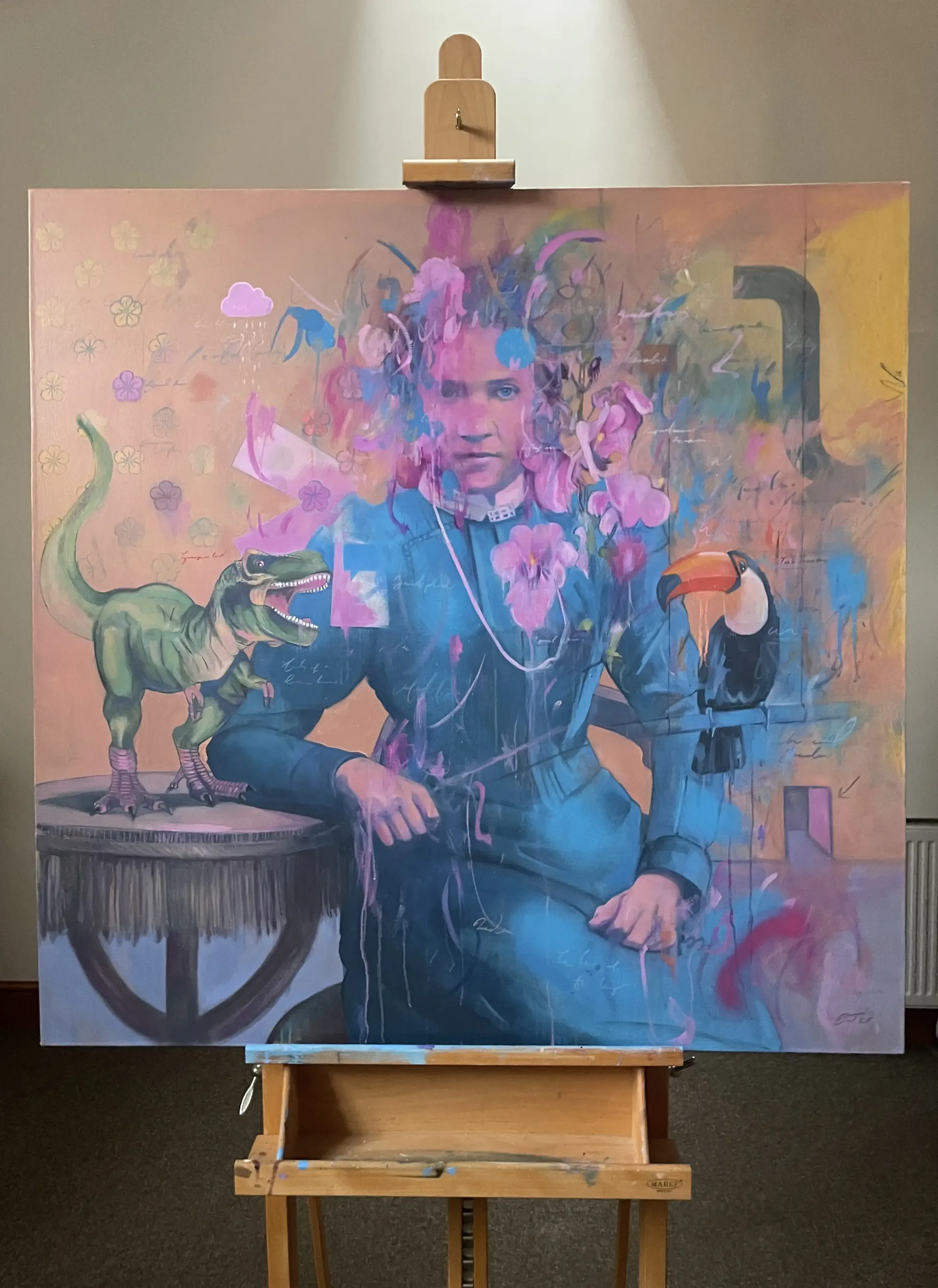
Menagerie (2026) I Oil and Mixed Media on Canvas
After my last posts - Evolution of a Painting #1 (The Merry Widow) and Evolution of a Painting #2 (Woman with Flowers) - here’s the companion piece to the latter called ‘Menagerie ’that I’ve recently completed.
Like ‘Flowers’, I spent an age fucking about with it, going nowhere through a lack of concentration before, finally, completing it in mid January this year.
2023
A start…then glacial progress.
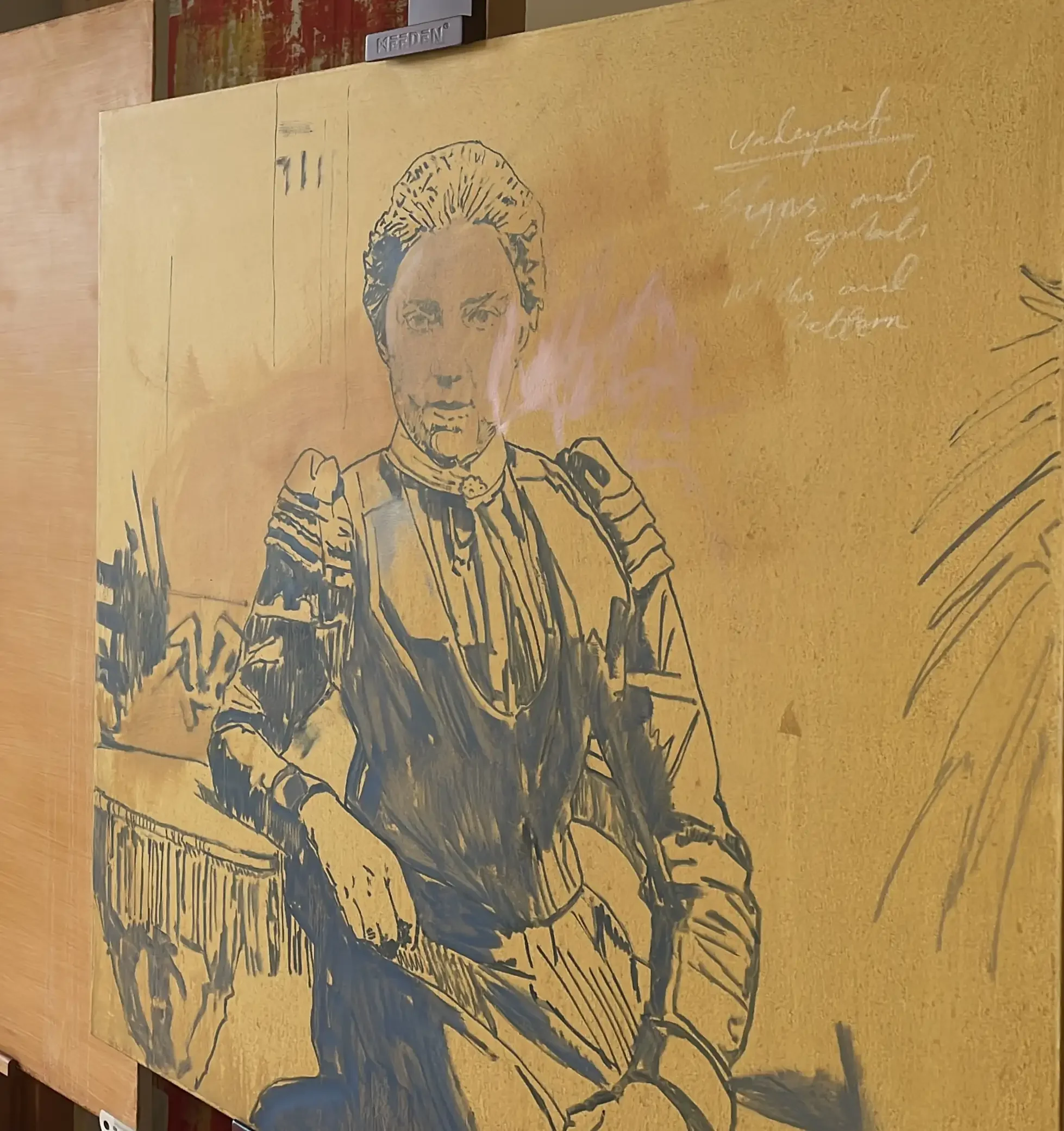
Having stretched, sized and primed the canvas, I added a base layer of yellow ochre and began the initial drawing in mid February 2023. I tentatively blocked in some colour, graphical shapes, florals and marks in July and August. I added in the T-Rex before going into a soporific slump with it.
2024
2024 was, like ‘Flowers’, a non-event for the painting and, besides blocking in some colours, adding in spray paint and other marks, little was achieved. There’s a moral in here somewhere…
2025
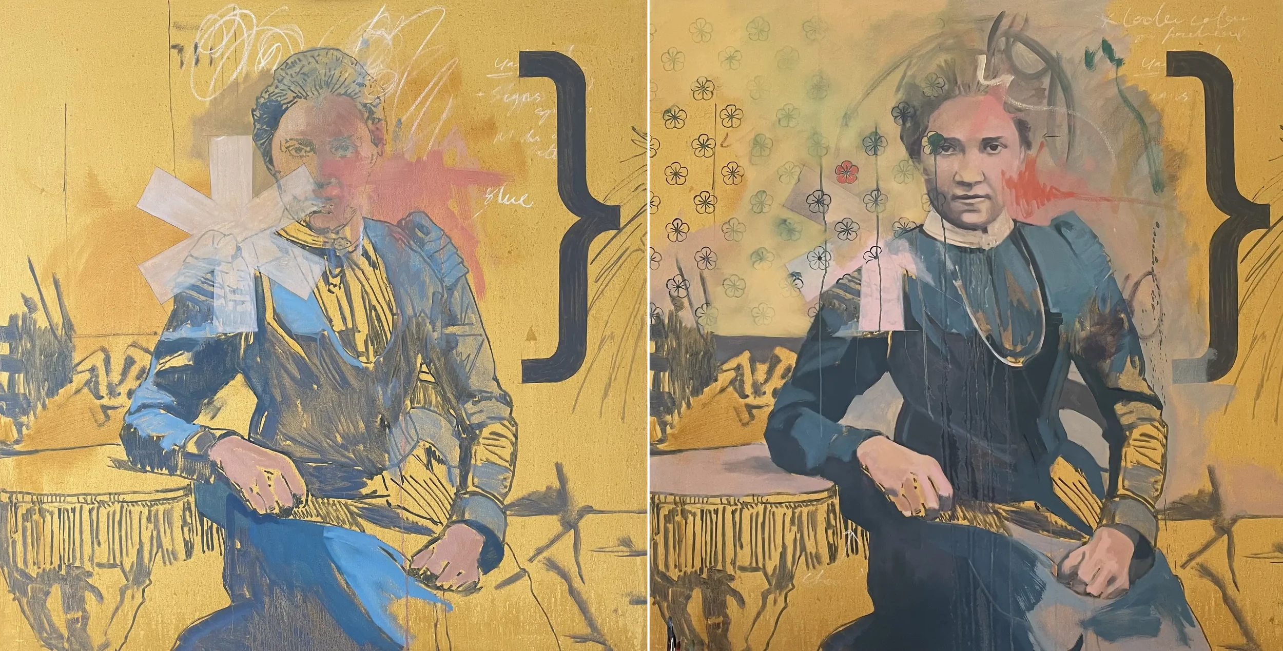
I wasn’t until September last year that I picked up things again. I was convinced there was a painting in there. With such an unforgivable gap, I decided to go for it with a lot more gusto, introducing new colours, more gestural mark-making and redrawing, restructuring and refining everything all at once.
I was actually beginning to enjoy the painting for the first time especially after months/years of loathing and ennui.
I started to get into a bit of rhythm and a much looser approach to it all by late 25 - go down fighting as it were. I began adding bolder marks, bringing in the florals to add depth and a bit of intrigue. The introduction of violets and fuchsias definitely opened things up more.
I’d barely touched the table, her hands and dress or the background since the painting had started way back in 2023 so I set to work modelling these.
2026 - To Completion
Things accelerated in late December - with an impending deadline for the London Art Fair fast approaching they had to! - through to its completion in early January. An intense period of painting over the festive period reaped rewards.
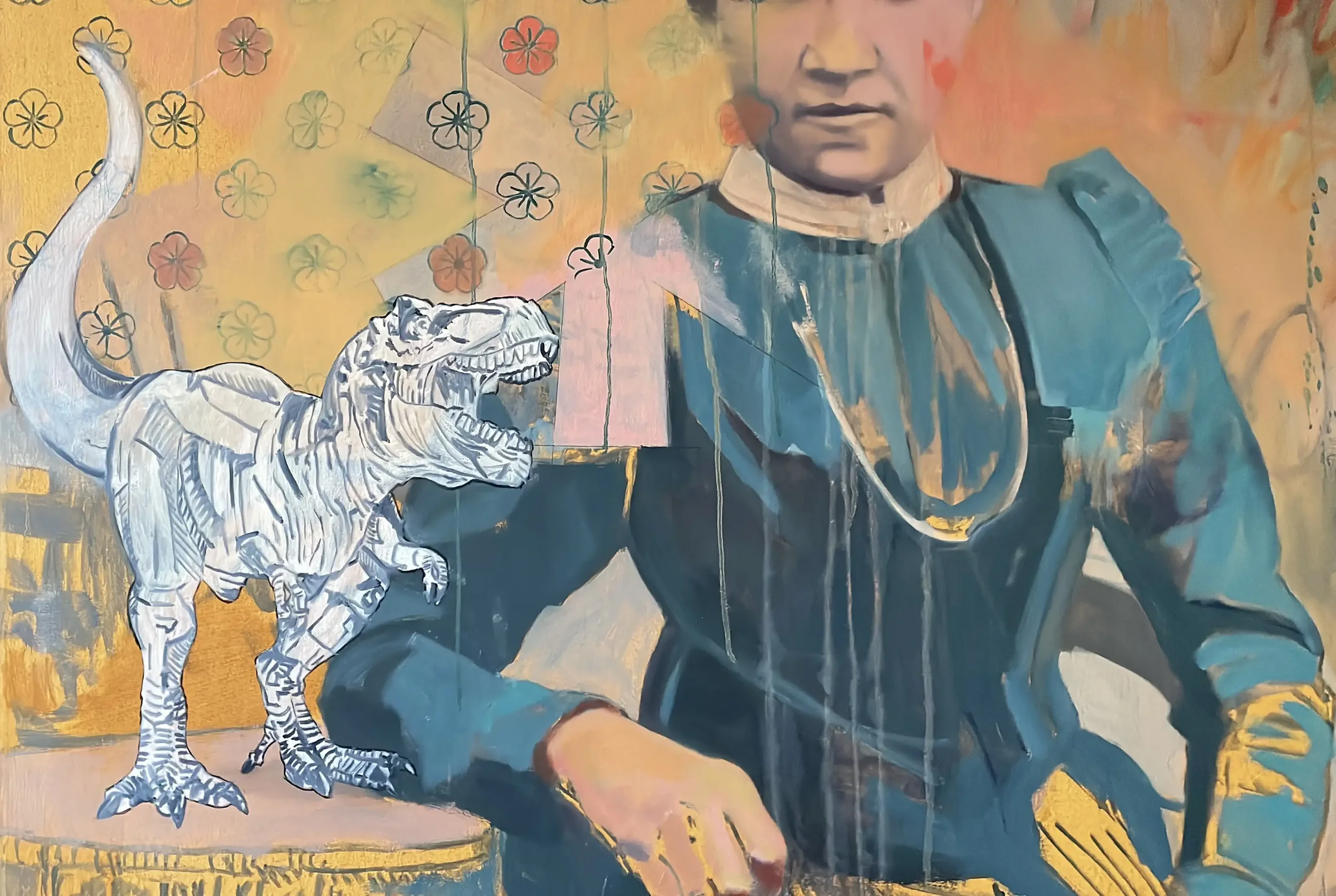
I added in the Toucan, the small doorway, stencilled shapes, a myriad of different marks and textures, writing and colour abstractions. I modelled the eye a little better and faded back the left side of her head.
I also worked on the hands and the dress and knocked back the bracket graphic to the right whilst tidying up parts of the background.
I worked like a demon and made great progress and I think it shows. There was a large measure of ‘if only’ but, despite there being many faults with the work, it is complete (or as much as it’s going to be!) and I’m fairly happy with it under the circumstances!
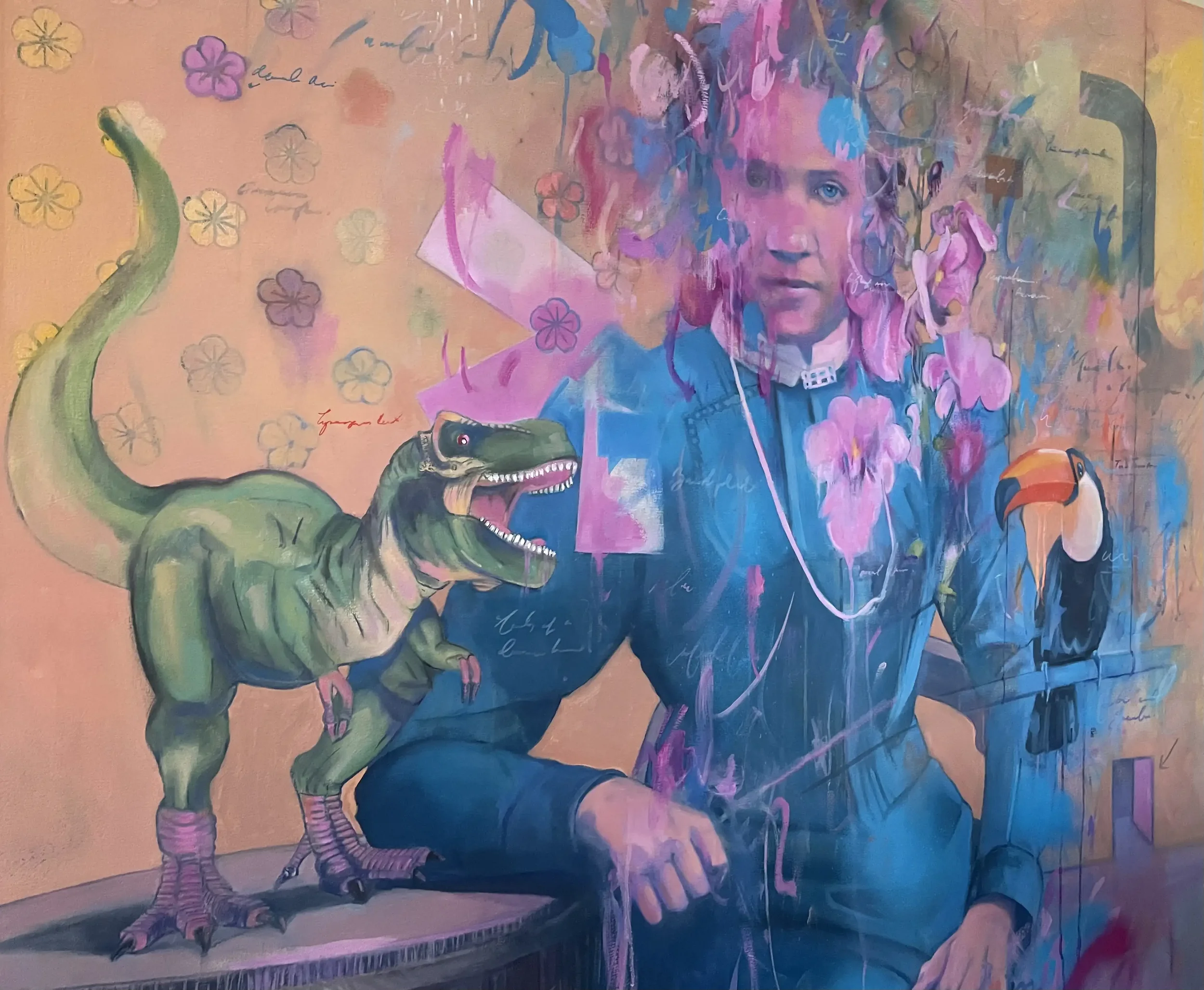
A layer of satin Ganvar varnish unified the myriad discrepancies and it dried beautifully.

I’ll never leave a piece to sit there unloved for that length of time again. It, and I, suffered a lot through its neglect. I’ve learnt hard lessons that I’ll take onboard and endeavour to paint with more clarity and focus. There is no other way.
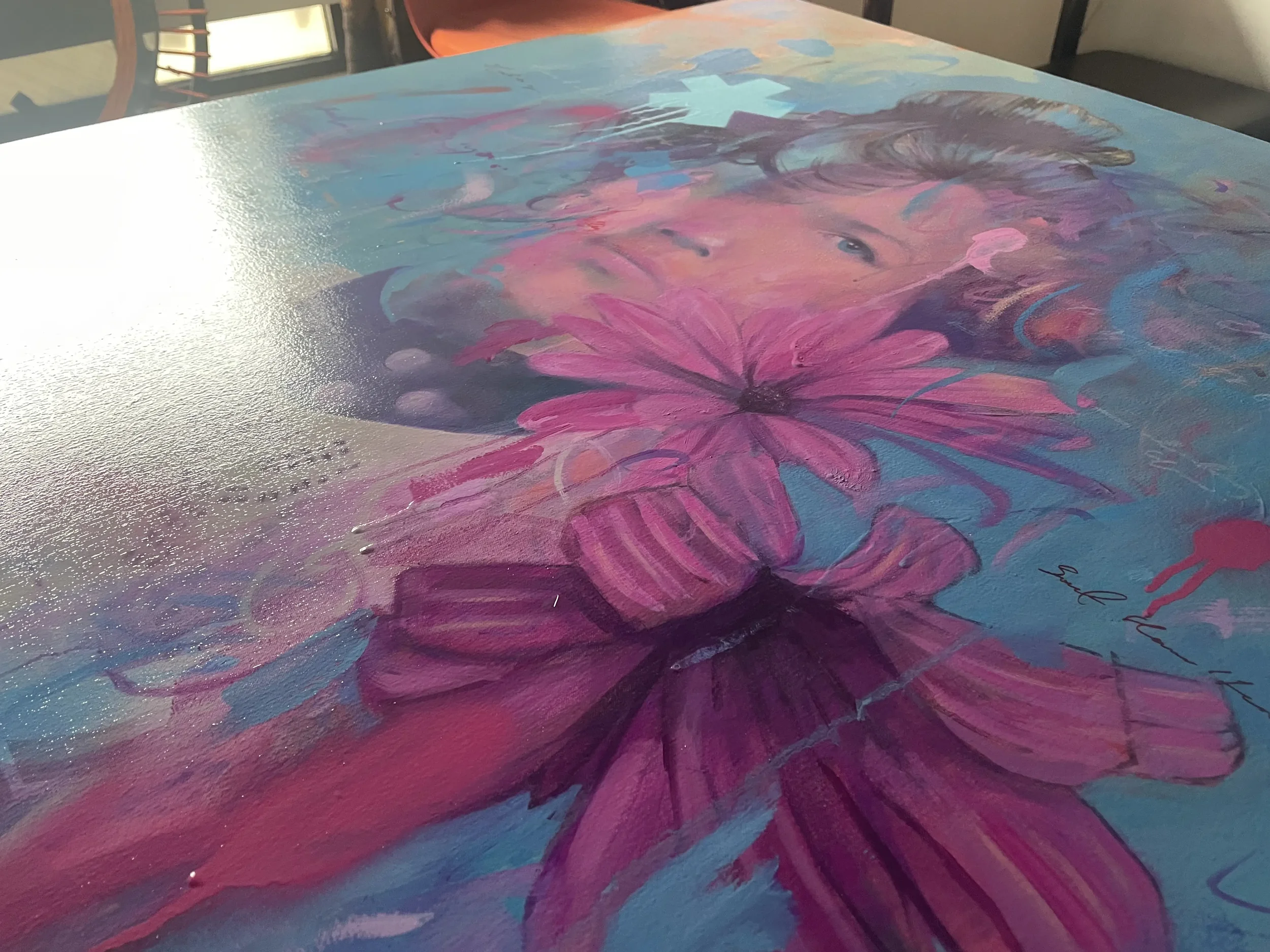
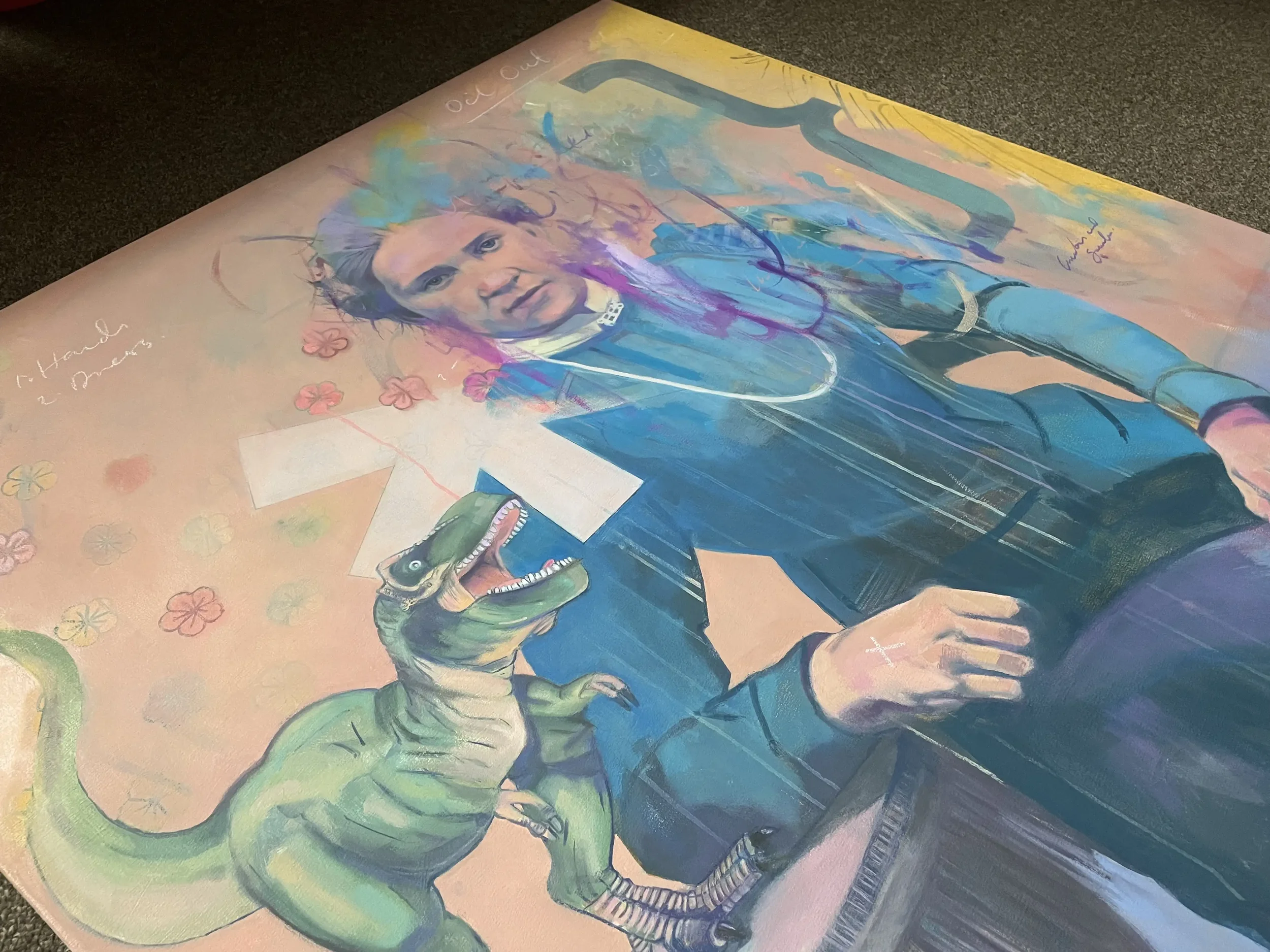
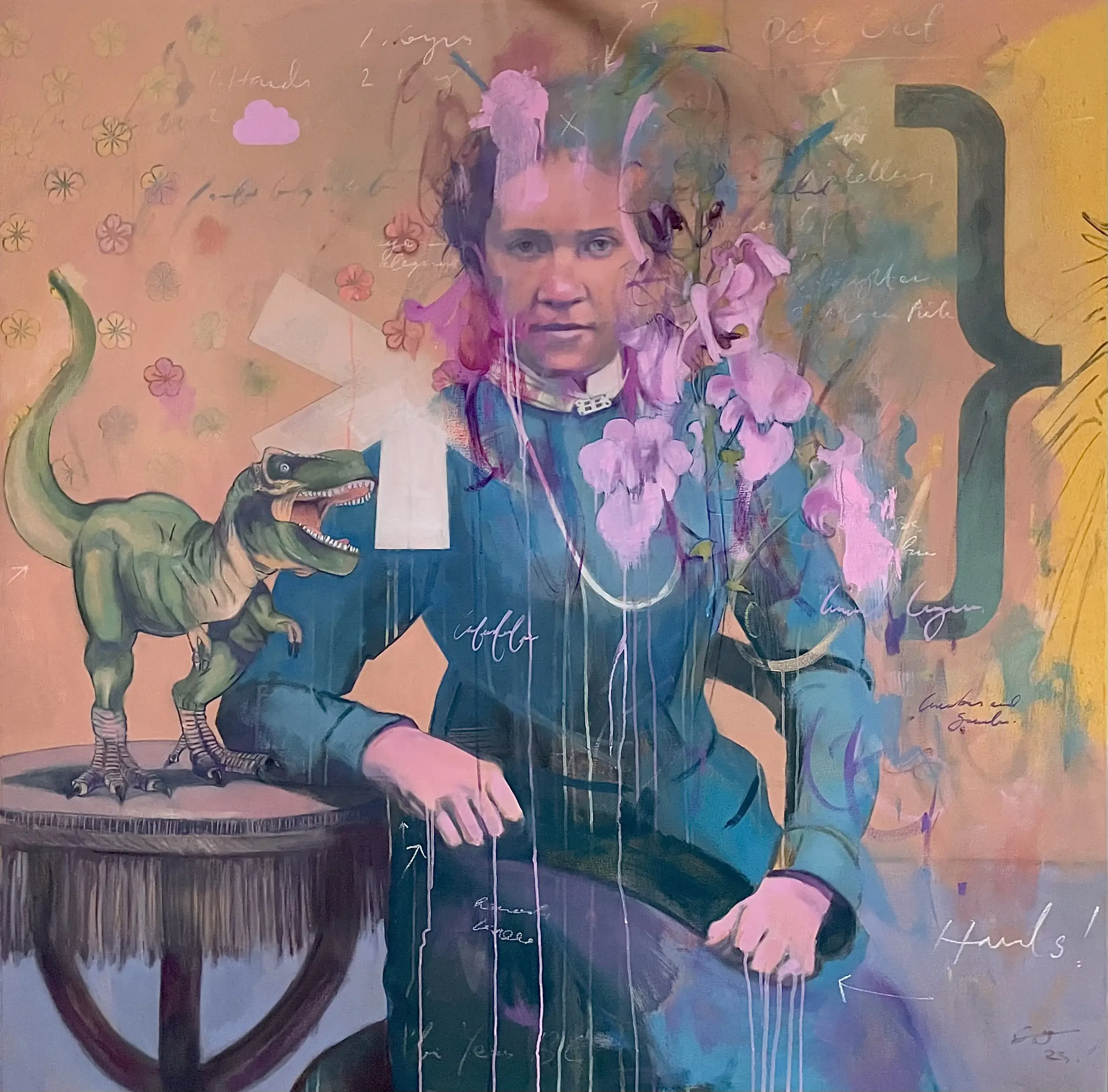
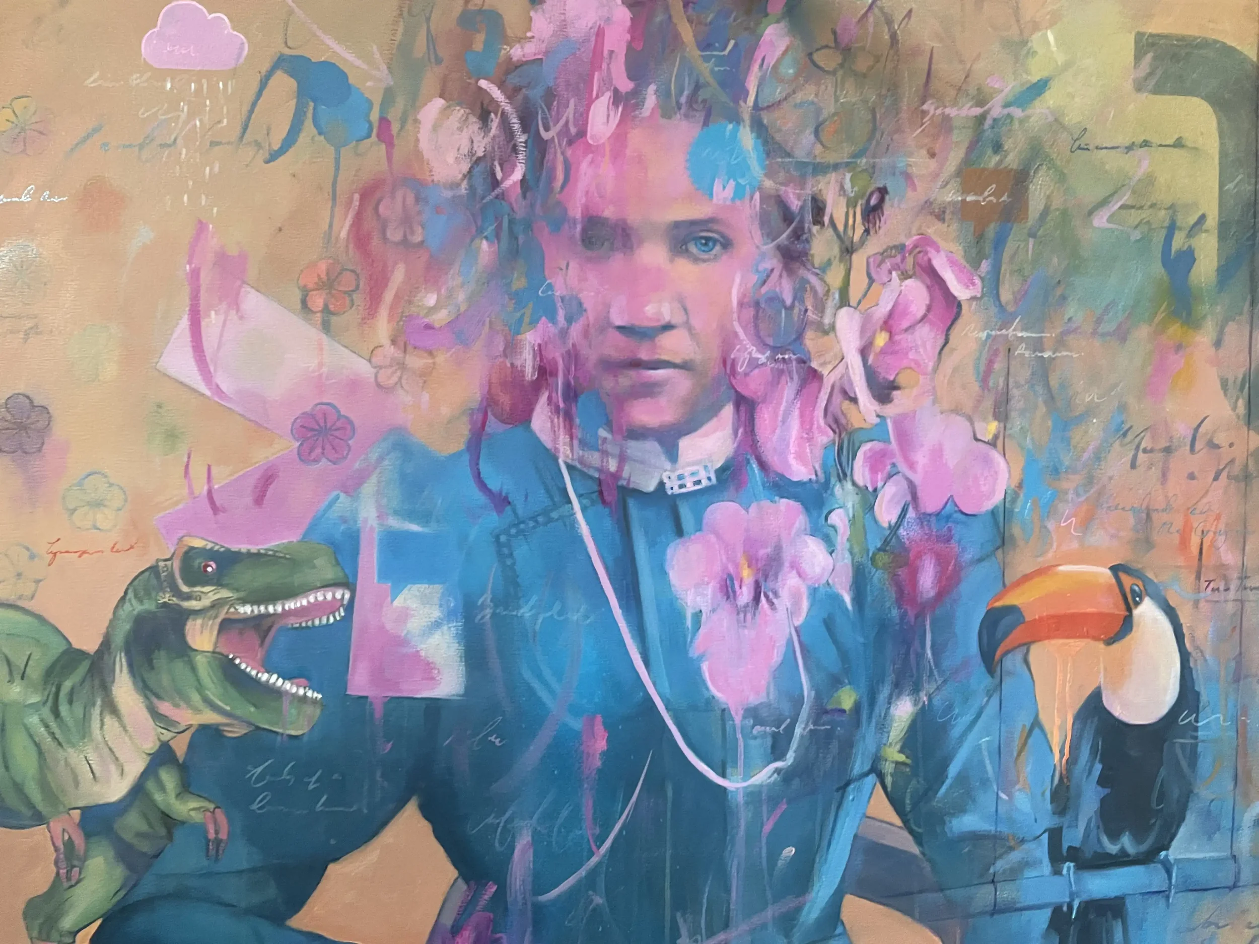
Evolution of a Painting #2
Woman with Flowers (2026) I Oil and Mixed Media on Canvas
After my last post - Evolution of a Painting #1 (The Merry Widow) - I thought I’d consider another, larger piece, ‘Woman with Flowers’ that I’ve recently completed. I spent months and months doing nothing on it (into the years) then it evolved quickly over a short period of time.
2023
Talk about a slow start.
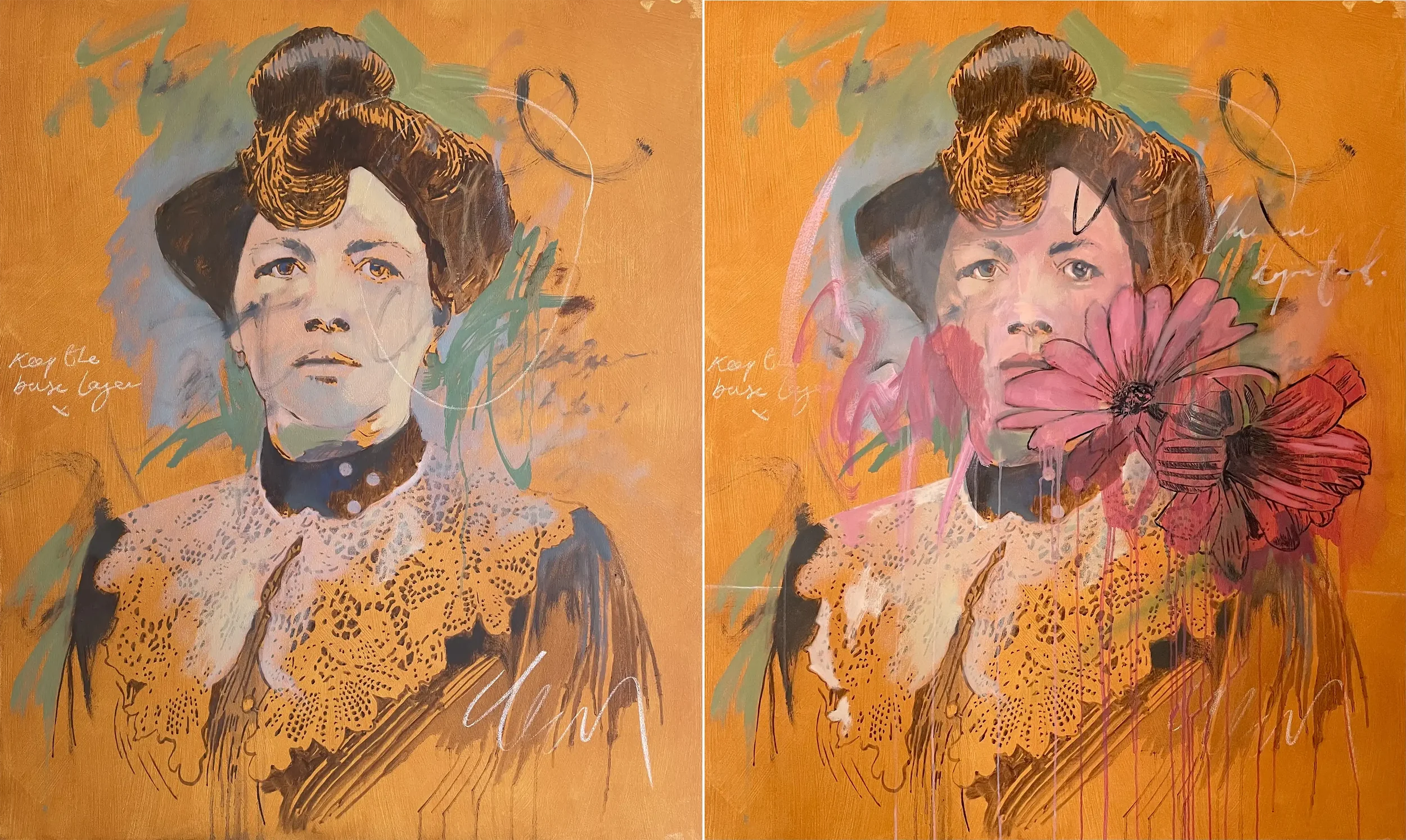
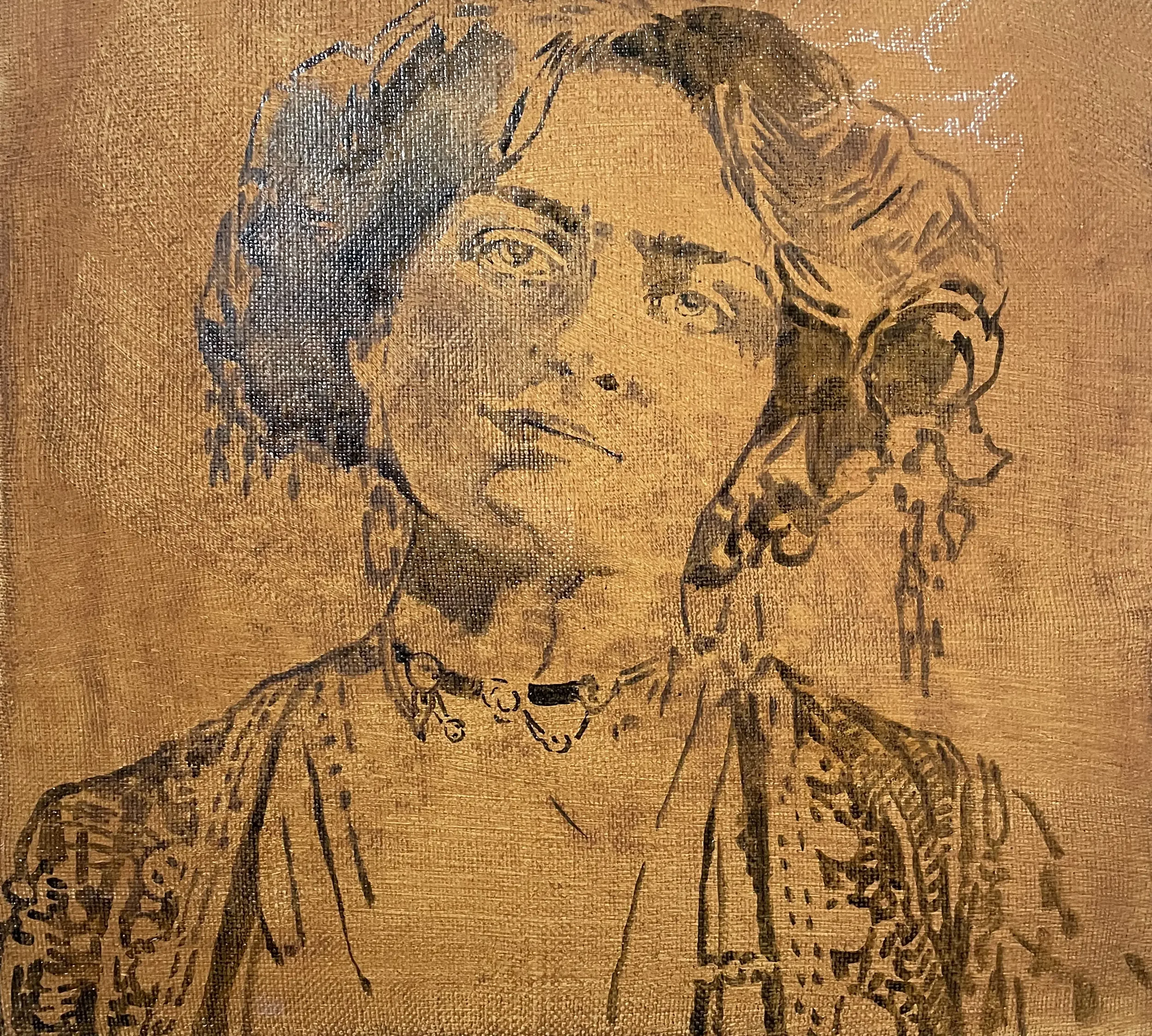
Having stretched the canvas (and sized and primed it), I added a base layer of yellow umber with a touch of yellow ochre (I think). After the initial drawing in mid April 2023, which I tentatively blocked in, I adding some colour and marks around her but not a lot else,
I did nothing until early Autumn when I added in the flowers (from my garden) and painted (badly) a bit more detail into her face and eyes. Pretty glacial, and it showed.
2024
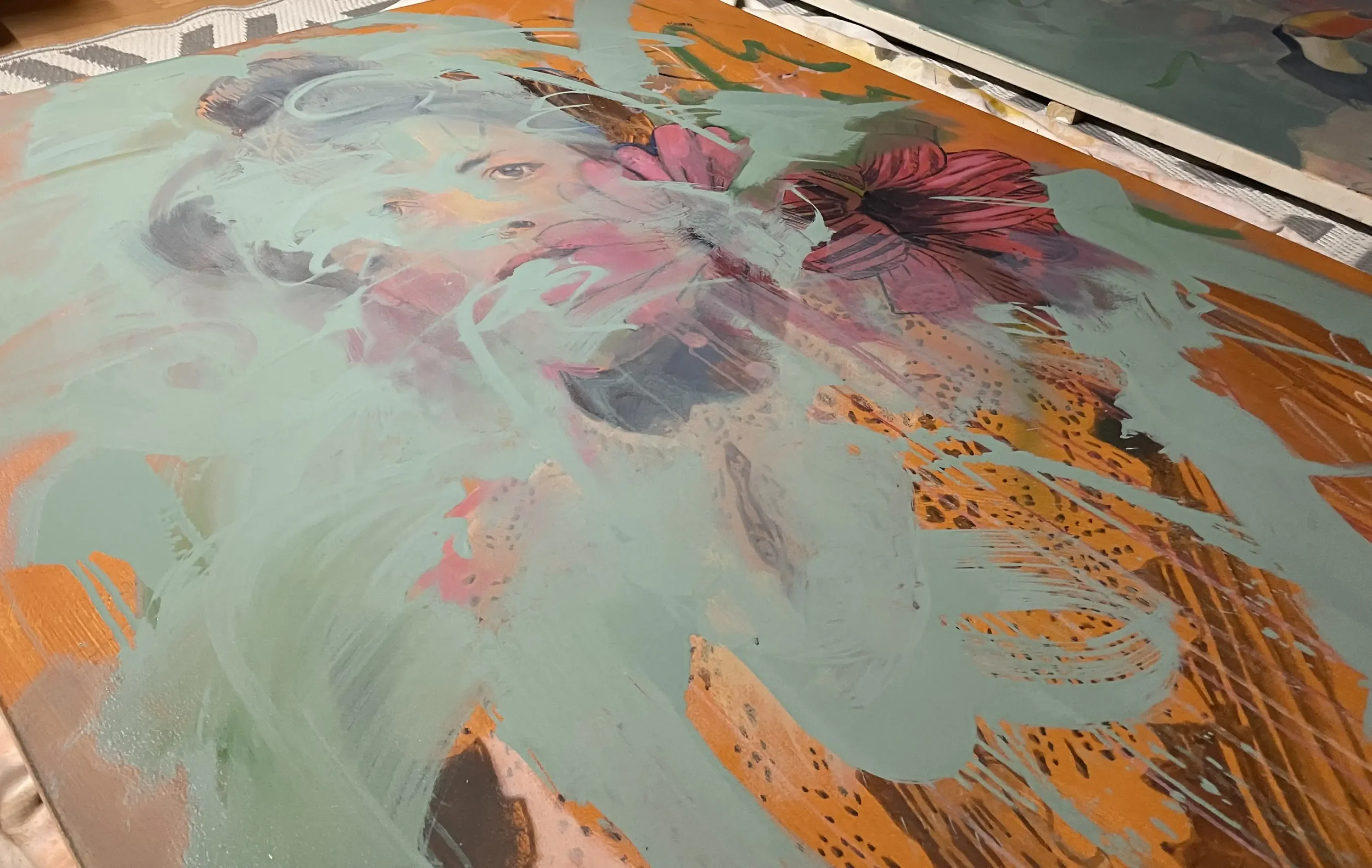
2024 was a non-event for the painting. Although I did almost ruin it out of frustration by adding a layer of thick pale green to her. My intention was to shake things up but, as the painting was at such a rudimentary stage, it was all a bit pointless. Most of it would disappear under the subsequent paint layers (though a little remained in the final edit).
2025
It took until last year in the summer months of June and July to start back. When paintings are left like this, you get incredibly frustrated and wonder what the point is. All momentum, any momentum, is lost and it’s like starting over but with less enthusiasm.
Still, I was convinced there was a painting there somewhere and with renewed determination I started to give it due attention.
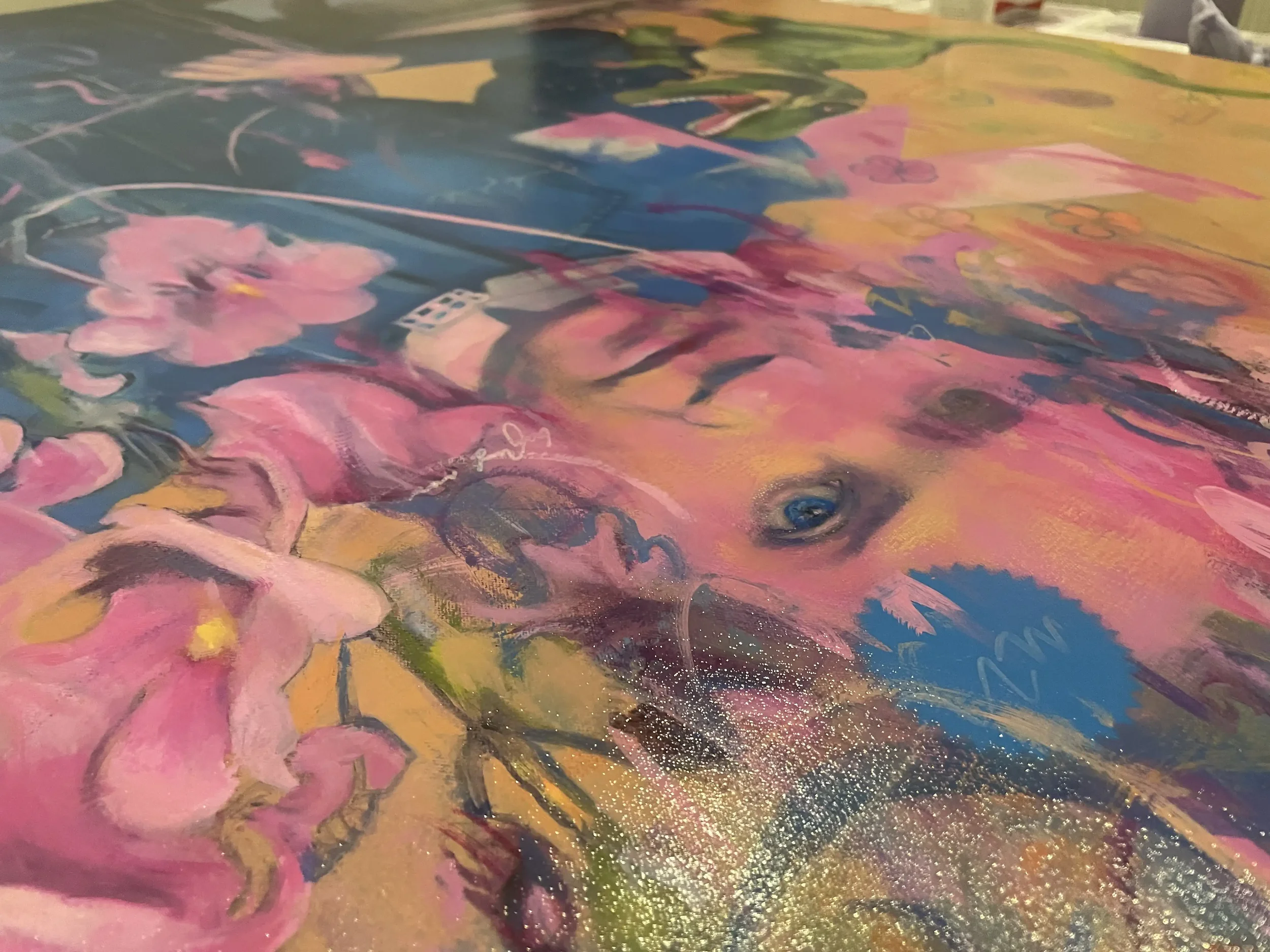
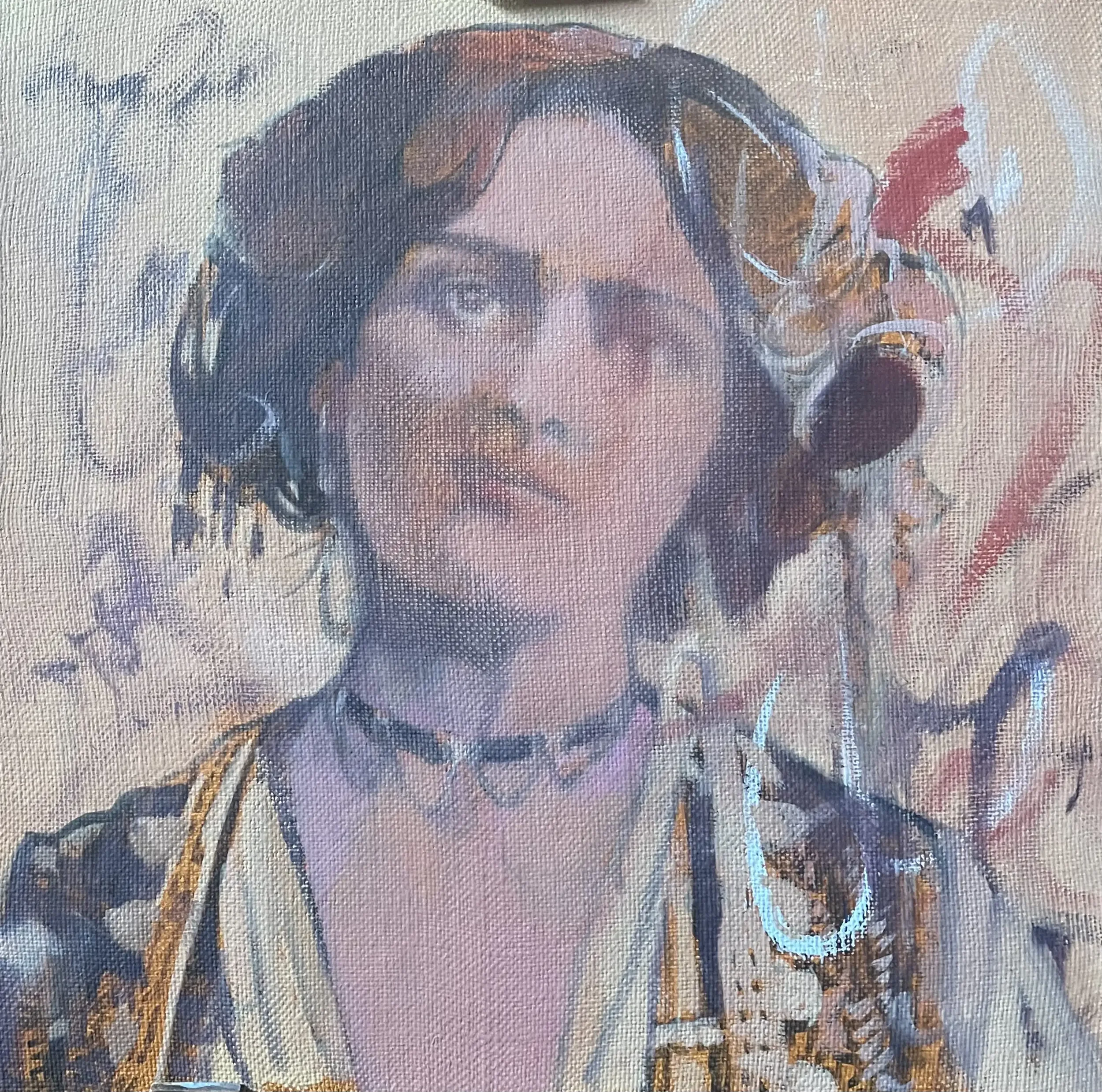
Forgive the colour variations in the photography above, but you can start to see some progression as I started to redraw her.
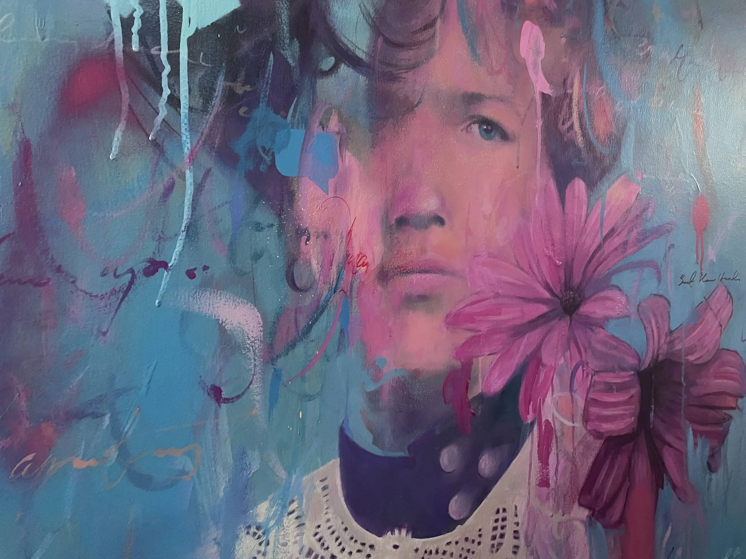
A decision was made to obliterate the left eye in order to create a sense of intrigue and depth. I also applied some spray paint to loosen things up a little. I softened the face around the eye and the mouth, intending for it to be an impressionistic portrait - and invariably to hide my own deficiencies! I also started drawing a little of the lace cardigan and softening the colours around the body introducing violets.
Breakthrough - Late July ( then sporadically through to December 2025).
The real breakthrough with any painting comes with simply doing it, not half-hearted or on-and-off, but actually putting in the hard yards and concentrating with real intent - just you and the painting. Everything else becomes redundant and that’s when real progression can be made.
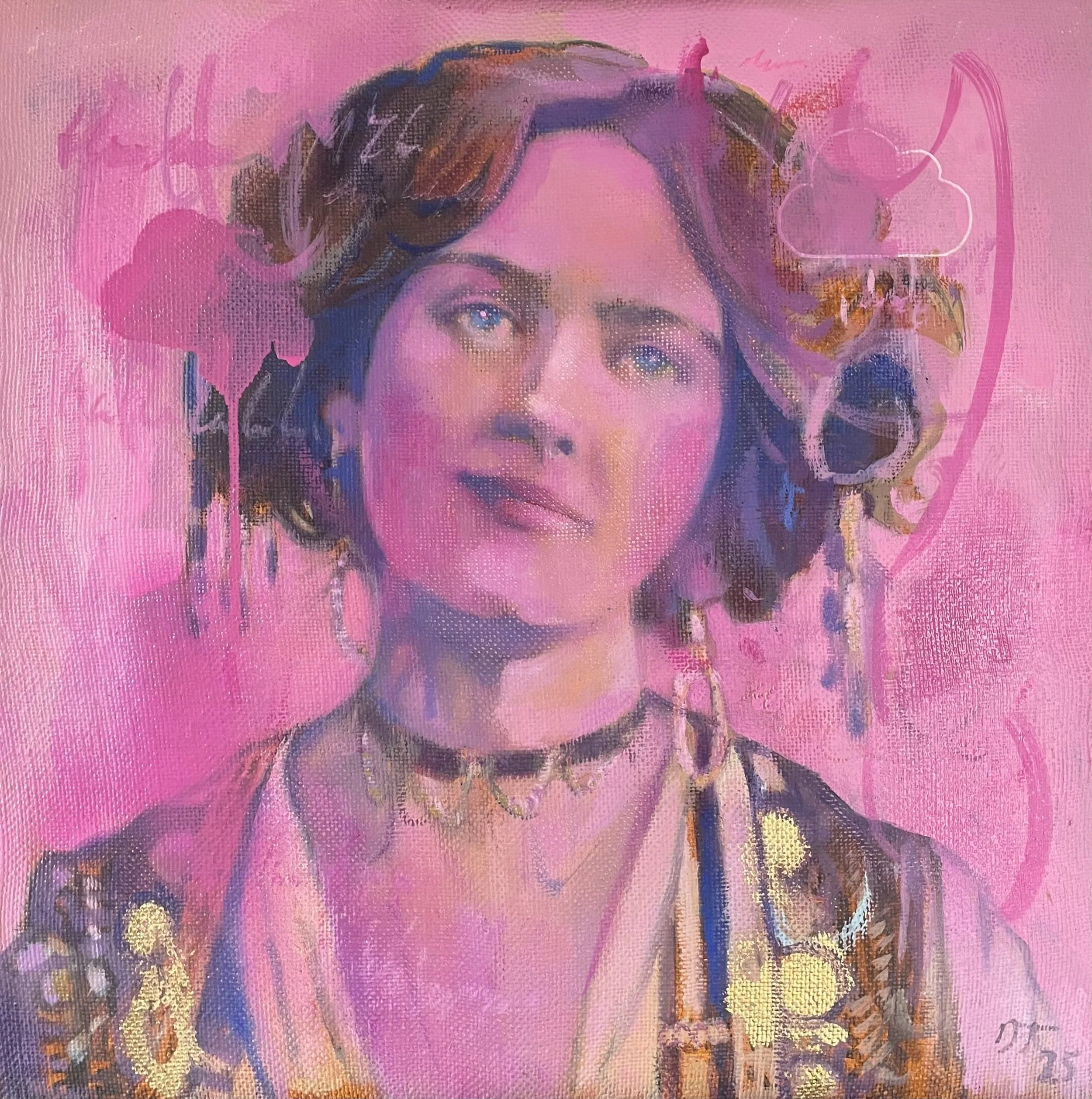
Above you can see I’ve introduced a blue background (left), largely removing the green. Fuchsia and magentas started to take colour prominence too and these were delicately introduced to the skin tones. More definition to the eye, nose and mouth followed, slightly altering her gaze as I went. I made more progress towards the end of the year (right), defining the lace along with the florals and adding spray paint motifs - asterisk and cloud - and brushstrokes ‘glitches’.
2026 - To Completion
Knowing that it was reaching a conclusion of sorts (and with the London ArtFair upcoming), I was able to be a little more playful in parts, adding colour, marks, spray paint, stencils (chat bubble, cloud), writing and sharpening up features like the flowers, lace and eye. I’m no portrait painter but I wanted to convey a sense of impermanence, of memory and of depth to the piece.

Finally, a layer of satin Ganvar varnish to unify the whole thing. Beautiful.
In retrospect, and with renewed vigour, motivation and a clearer direction, I’ll never leave a piece to sit there unloved for that length of time again. Whilst I’m pretty happy with the work, it’s suffered a little through neglect.
But I’ve learnt a lot through these failures and I’ll take them onboard and endeavour to paint with more clarity and focus.

Evolution of a Painting #1
The Merry Widow (2026) I Oil and Mixed Media on Linen
I thought I’d take the time to illustrate the processes that I go through to get to a ‘finished’ point in an artwork (not always successfully).
It could be any piece but I’ve chosen one of my most recent ones (completed 3 days ago) entitled ‘The Merry Widow’ which I showed at the London Art Fair 2026.
I had a small piece of heavy linen, almost sack-like, that I’d avoided using. Now, no fear, get on with it.
Incidentally, Francis Bacon painted on very heavy linen - he actually painted on unprimed linen, preferring its unique rawness. It’s something I’ll definitely pursue going forward.
Anyway, I made a small stretcher, stretched the canvas, sized then oil-primed it before applying a base of Umber then drawing the basics of the portrait in a neutral Paynes Grey.
I normally start by blocking in colour or shades and also messing around with strokes, glitches and experimental mark-making. This fits into my Carte Vista stylisation - the idea that we are temporary glitches, apparitional and spectral. It also allows me to play with pentimenti, leaving initial marks that either meld into or disappear from the substrate.
Now for some decisions.
I’ve been using a lovely range of violets, magenta and fuchsias previously so it made sense to bring in this colour palette - again, associated with religiosity, penitence and poignancy, all in keeping with my Carte Vista series. You can see I start to tighten up areas, previous marks have disappeared under paint layers and I’ve started to form her head and eye structures, but very tentatively.
What I don’t want to do is to make it a precise portrait - there must be a sense of ambiguity to it, an otherworldliness. The eyes, for instance, require an element of the ethereal. Not only that but the surface (as you can see on the left cheek and lips) is both unforgiving and forgiving at the same time - you can easily remove paint for good or ill.
I felt I was now making progress. On the top image, I rubbed back some of the pink to reveal previous marks, adding in more definition to everything as I went. On the lower image I played around a little - usually at midnight like some deranged cat, I’d have a mad hour - adding in more glitches, colour and definition. I like to add in little bits of writing - notes, anatomy annotations, gobbledygook.
You can see the cloud motif top right - it’s on all the Carte Vista work, symbolising the transient nature of things - and it’s a nod to my visual design background too. I was beginning to feel happier about the colours though I needed to work on the mouth and eyes a bit more.
Excuse the colour differentiation (variable light conditions).
Softly, softly, catchy monkey.
As this is only a small piece (40x40) and I was dealing with more substantial works that had more urgency, I was able to go back and forth at leisure, shaping, crafting and refining. For me, it’s also important to keep some of the base layer I started with, not to apply the paint too thickly. This allows the work to have depth, a slight theatrical sense of fore, middle and background. The hair and parts of the dress retain the original Umber.

Happy enough with the dreaminess of the eyes and the basic knowing smile of the mouth, I applied a cloud stencil of pink spray paint that had just arrived. It accidentally dripped but I’m quite fond of the touch of serendipity. The last thing was adding gold leaf (I’ve had the same load since I worked in Manhattan as a textile designer in the mid 90s!) to her dress. I think it works.
Talking of textiles - my background as a printed textile designer has instilled a focus on surface manipulation and tactility. The sheen of spray paint, the reflective nature of gold leaf and metallic paints, the flatness of silkscreen printing, these things are important to me.
And FINALLY. No turning back, time to apply a satin varnish. Goodbye, my beautiful Miss Lily Elsie, The Merry Widow. For now at least…