Design Projects

Vero = Accurate


Overview

Following Vero’s acquisition by Accurate, a large US-based international screening company, the immediate challenge was how to bring the two brands together without losing Vero’s strong and recognisable identity.

An interim brand ‘fusion’ was needed for upcoming events and communications while the businesses moved towards a more unified identity.

Vero logo on a black circular background.
An illustration of the letter 'a' with a pink right triangle attached to its lower right side.

My Role

Building on my long-standing relationship with Vero, I led the creative direction for this transitional phase, exploring how the visual languages of both organisations could be combined into a coherent system.

The work spanned brand development, presentations, communications and event design, including major industry events such as HRTech and RecFest.

Impact

The resulting system gave Vero and Accurate an immediate way to present themselves together following the acquisition, retaining elements of Vero’s established character while introducing Accurate’s identity.

It provided a flexible visual bridge between the two organisations that could be applied across events, presentations and communications during the transition.

amalgamating the visual strengths of both organisations


Brand Fusion

Three geometric shapes: a circular gradient with a starburst pattern, a square with a gradient of reddish-orange hues, and a pink right-angled triangle.
Two rows of six colored circles each, arranged horizontally with a black background. The top row has dark blue, royal blue, magenta, silver, lavender, and light purple circles. The bottom row has royal blue, pink, black, orange, and gray circles.
Three interconnected squares filled with geometric pink and blue patterns on a white background.
Abstract digital artwork with a pink background and a circular pattern of overlapping semi-transparent black triangles.
Two men in conversation, one older with glasses and white hair, the other younger with glasses, both in a professional discussion, image has a blue overlay and geometric design elements.
Slide titled 'Star-spangled Screening' with a small star icon above the text and the company logo 'accuratevero' at the bottom.
null

HRTech Conference Event

A miniature architectural model of a room or stage with white walls and curved partition walls, a plain rectangular picture frame on the back wall, and a base with geometric patterns in pink and gray.
Architectural model of an interior space with curved white walls and rectangular display panels, set on a floor plan with a circular design.
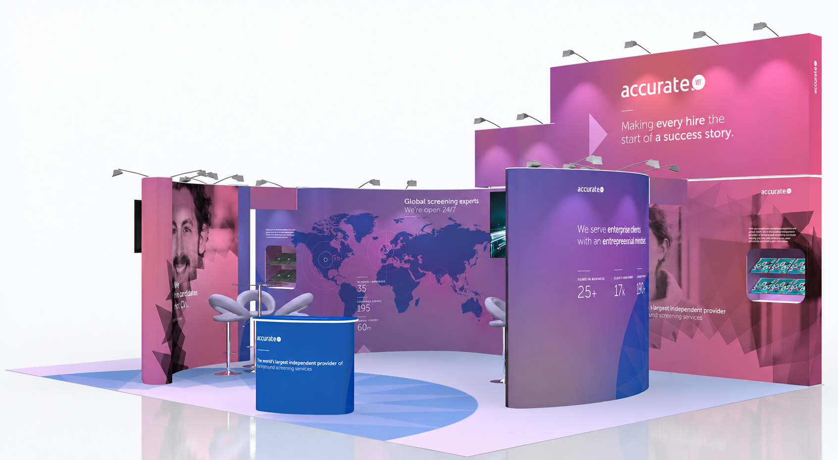
Trade show booth with purple and pink branding for 'accurate', including a curved backdrop with large images, two chairs, two screens, and informational displays.
A smiling woman with glasses sitting at a desk in an office environment, accompanied by a website overlay with business information and statistics.
A digital advertisement for a candidate screening service featuring a smiling man with curly hair and beard on a purple background with geometric shapes. Text highlights global expertise, entrepreneurial spirit, and positive candidate experience.
Two-page corporate flyer with a purple and blue geometric background. The left page features a woman's smiling face with text 'Making every hire the start of a success story' and the company logo 'accurate' at the bottom. The right page details the company's background screening services, benefits, icons of services like pre-employment screening, criminal record searches, compliance, online social presence, activity verification, global searches, driving history, workforce monitoring, and statistics on languages, countries served, and annual checks.
Business card with a blue and purple gradient background. The front displays the logo 'accurate vero.' The back contains the name William Craig, title Senior Screening Consultant, with contact details including a phone number, email, and website.
Trade show booth with purple walls, branding for 'accurate,' featuring text about enterprise client services, a large photo of a man, a world map, and seating area with tables and chairs.

RecFest Event

A stylized orange map with topographic lines, featuring the black text "The Adventure Starts Here" and a small black circle with the word "VERO" at the top center. An arrow points downward at the center.
Logo text that says 'Life's a Beach' in black, cursive font.
Deck chair with a fabric backrest displaying the logo 'vero.' and the tagline 'Every hire is the start of an adventure' on a plain white background.
Group of stylized icons representing fashion items: a pink sleeveless top, white hat with pink star, white and pink bag with lightning bolt, pink fabric, pair of orange flip-flops, and a coin with a pink star.
Pink logo with circular text that reads "Every Hire's An Adventure" and "ESTD 1997" on sides, with a stylized signature of the word "Vero" in the center.
Two eco-friendly stickers with the text "Carbonsions of Off Set." The left sticker is round with a gray border, green text, and a black center featuring a leaf inside a recycling symbol. The right sticker is also round, green, with white text, and depicts a mountain range with trees at the base.
A camper van with a forest and mountain graphic, company branding, and the slogan 'Every hire is the start of an adventure.'