Evolution of a Painting #1
The Merry Widow (2026) I Oil and Mixed Media on Linen
I thought I’d take the time to illustrate the processes that I go through to get to a ‘finished’ point in an artwork (not always successfully).
It could be any piece but I’ve chosen one of my most recent ones (completed 3 days ago) entitled ‘The Merry Widow’ which I showed at the London Art Fair 2026.
I had a small piece of heavy linen, almost sack-like, that I’d avoided using. Now, no fear, get on with it.
Incidentally, Francis Bacon painted on very heavy linen - he actually painted on unprimed linen, preferring its unique rawness. It’s something I’ll definitely pursue going forward.
Anyway, I made a small stretcher, stretched the canvas, sized then oil-primed it before applying a base of Umber then drawing the basics of the portrait in a neutral Paynes Grey.
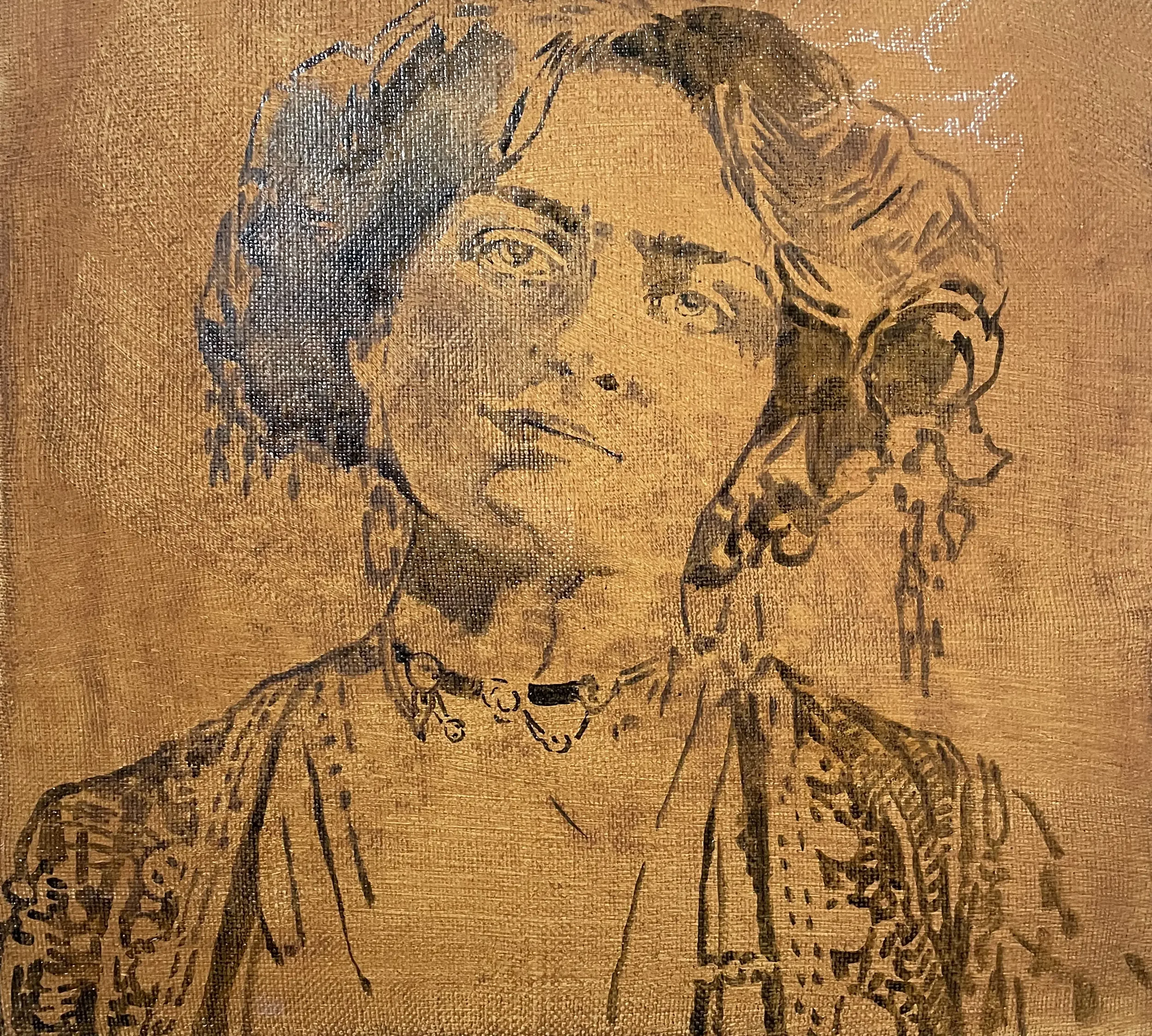
I normally start by blocking in colour or shades and also messing around with strokes, glitches and experimental mark-making. This fits into my Carte Vista stylisation - the idea that we are temporary glitches, apparitional and spectral. It also allows me to play with pentimenti, leaving initial marks that either meld into or disappear from the substrate.
Now for some decisions.
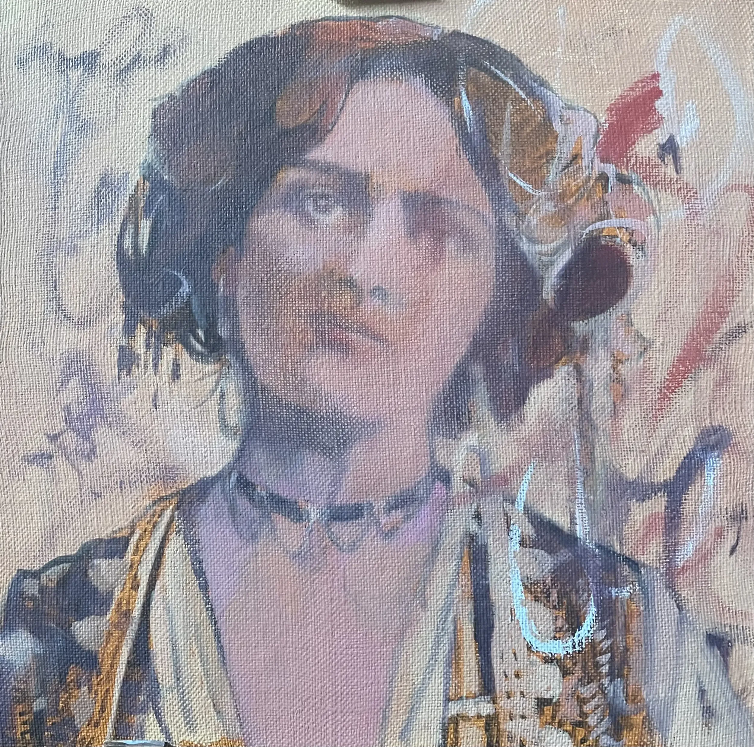
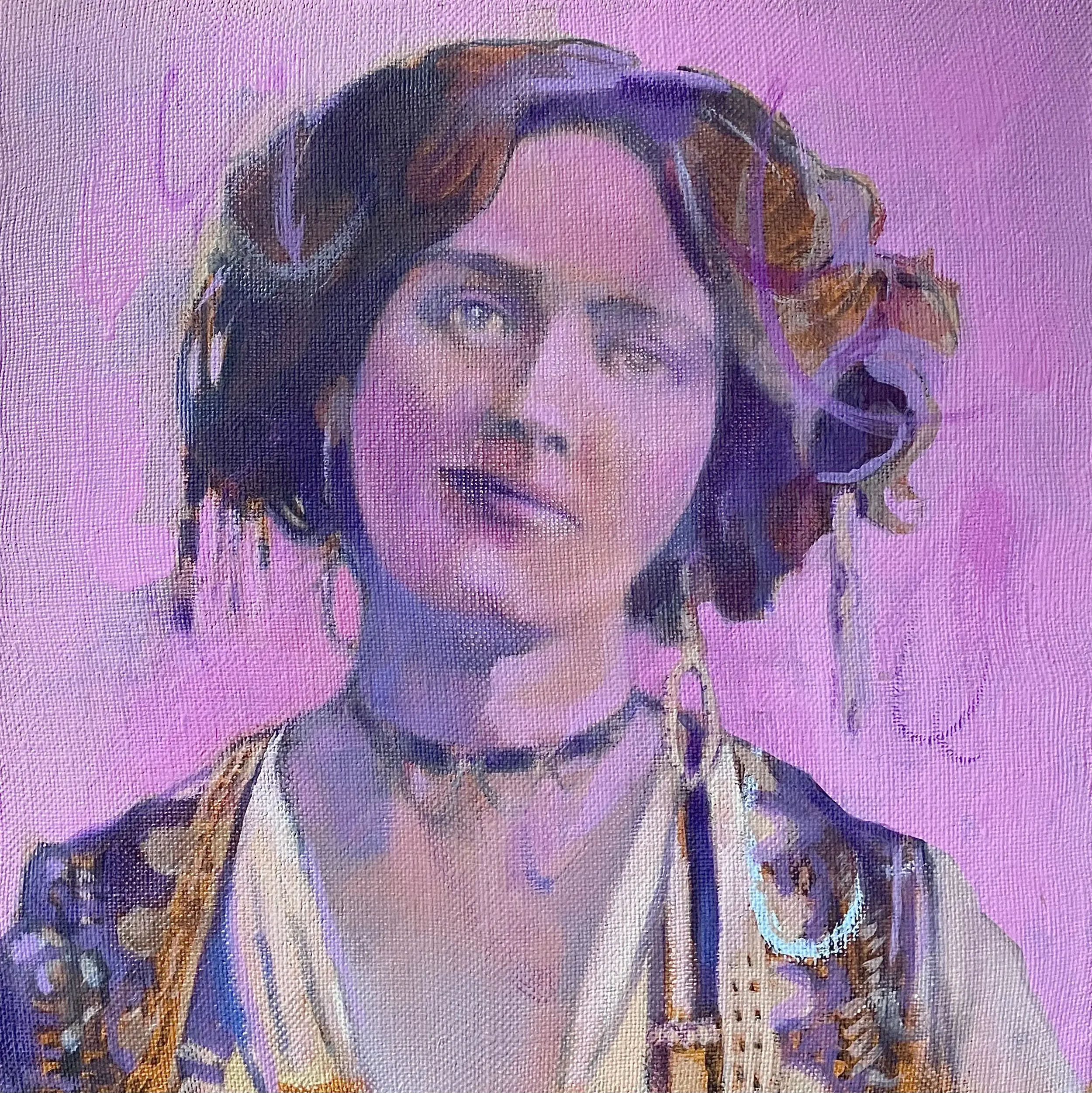
I’ve been using a lovely range of violets, magenta and fuchsias previously so it made sense to bring in this colour palette - again, associated with religiosity, penitence and poignancy, all in keeping with my Carte Vista series. You can see I start to tighten up areas, previous marks have disappeared under paint layers and I’ve started to form her head and eye structures, but very tentatively.
What I don’t want to do is to make it a precise portrait - there must be a sense of ambiguity to it, an otherworldliness. The eyes, for instance, require an element of the ethereal. Not only that but the surface (as you can see on the left cheek and lips) is both unforgiving and forgiving at the same time - you can easily remove paint for good or ill.
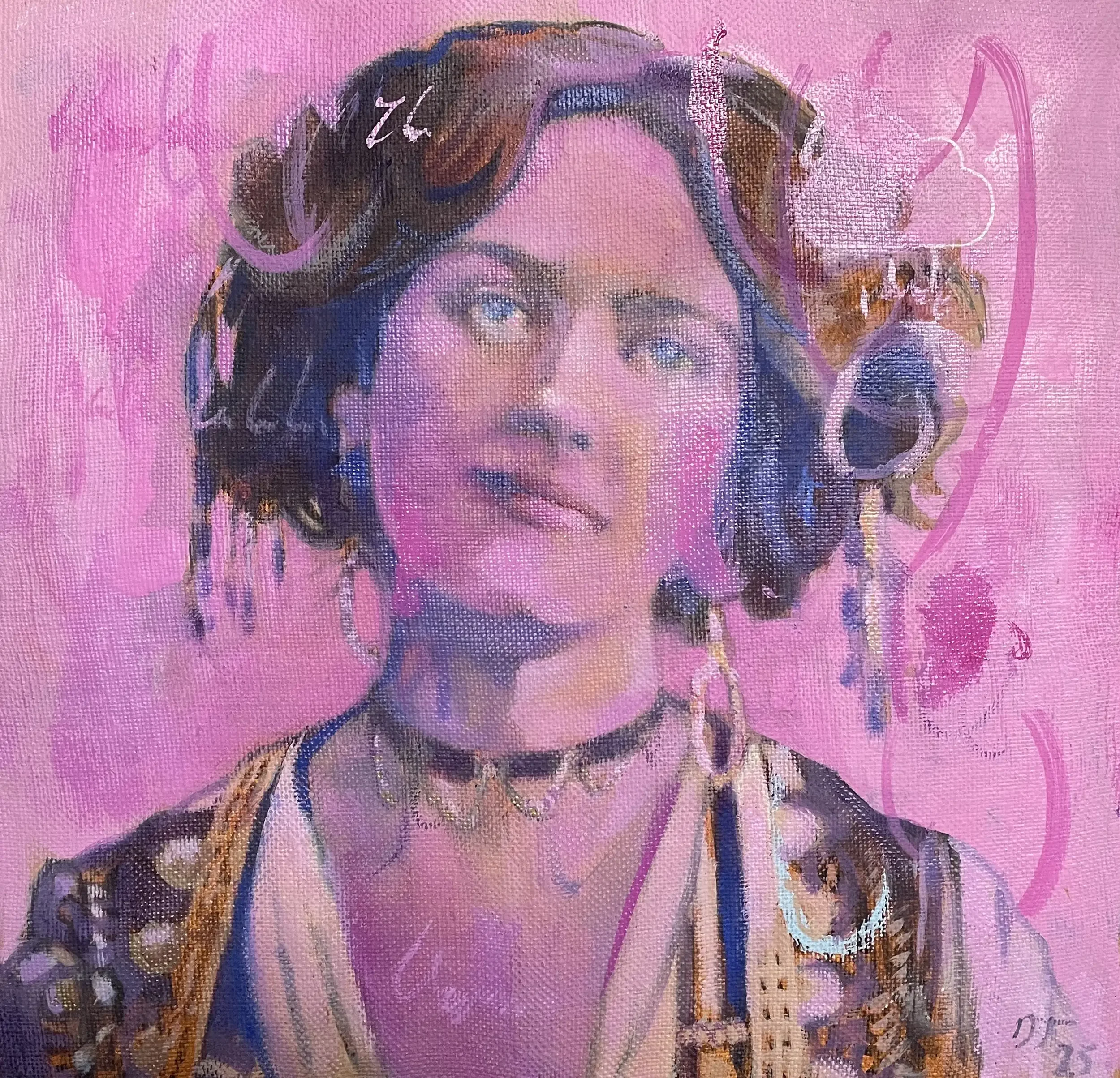
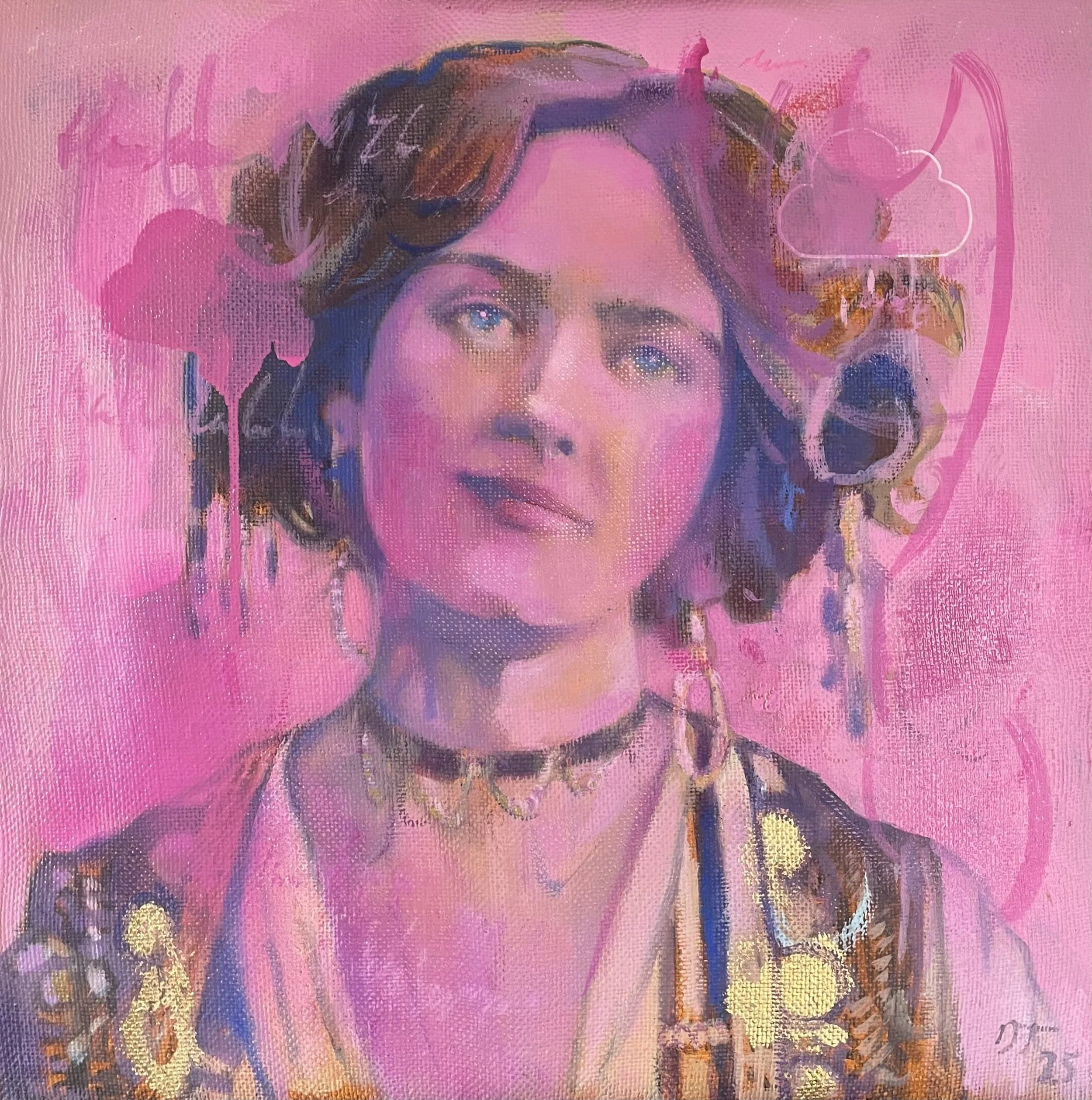
I felt I was now making progress. On the top image, I rubbed back some of the pink to reveal previous marks, adding in more definition to everything as I went. On the lower image I played around a little - usually at midnight like some deranged cat, I’d have a mad hour - adding in more glitches, colour and definition. I like to add in little bits of writing - notes, anatomy annotations, gobbledygook.
You can see the cloud motif top right - it’s on all the Carte Vista work, symbolising the transient nature of things - and it’s a nod to my visual design background too. I was beginning to feel happier about the colours though I needed to work on the mouth and eyes a bit more.
Excuse the colour differentiation (variable light conditions).
Softly, softly, catchy monkey.
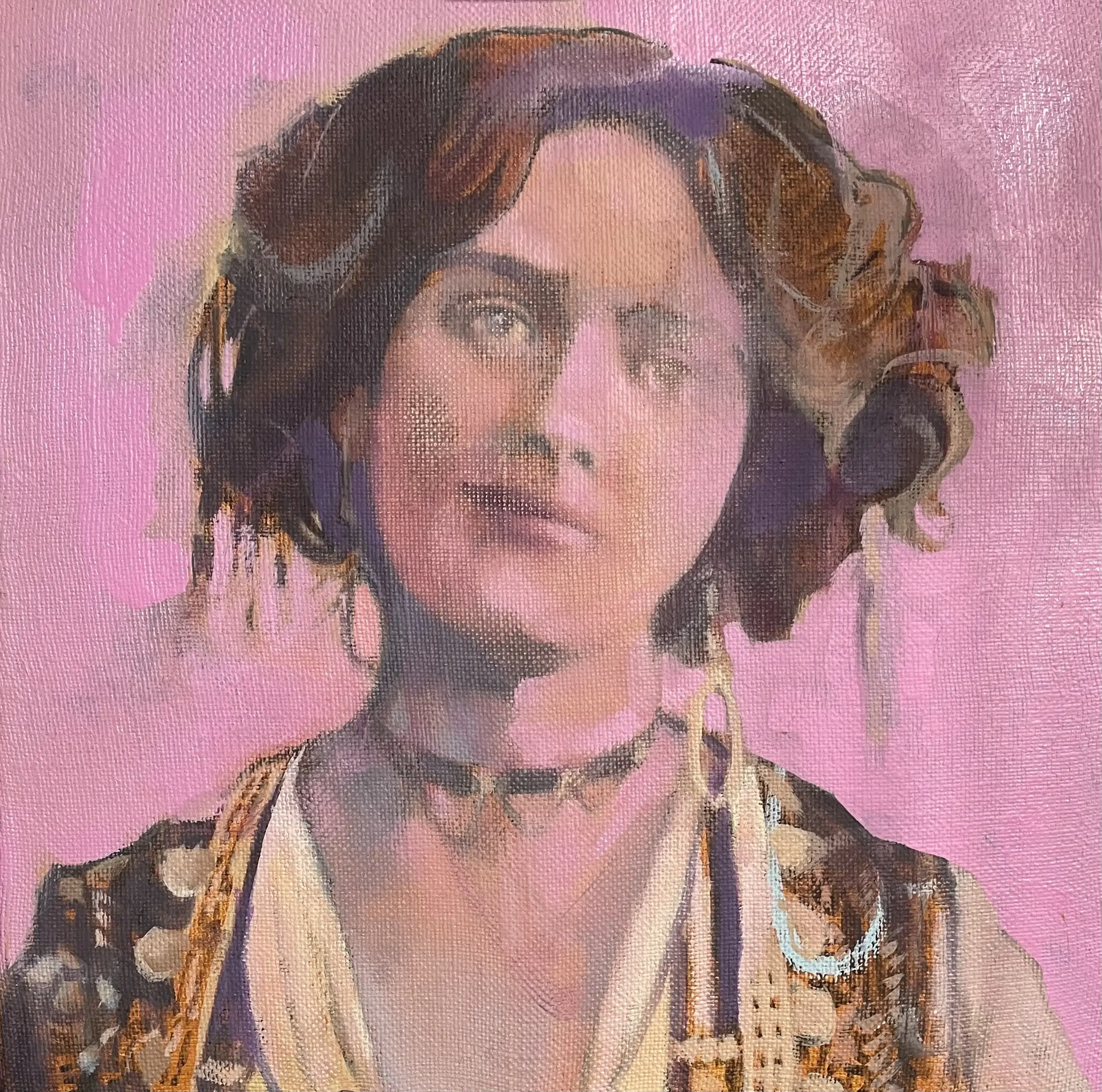
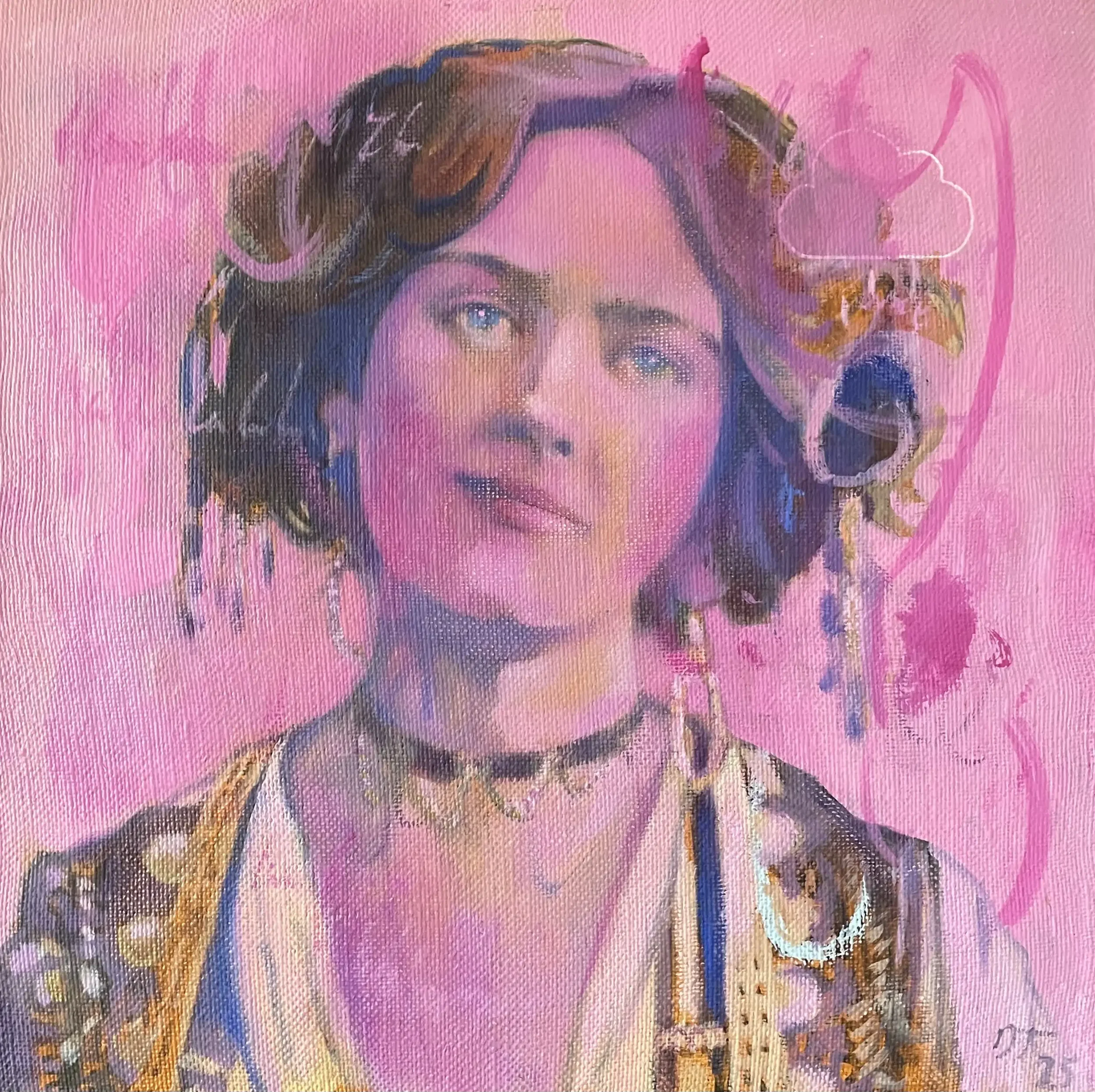
As this is only a small piece (40x40) and I was dealing with more substantial works that had more urgency, I was able to go back and forth at leisure, shaping, crafting and refining. For me, it’s also important to keep some of the base layer I started with, not to apply the paint too thickly. This allows the work to have depth, a slight theatrical sense of fore, middle and background. The hair and parts of the dress retain the original Umber.

Happy enough with the dreaminess of the eyes and the basic knowing smile of the mouth, I applied a cloud stencil of pink spray paint that had just arrived. It accidentally dripped but I’m quite fond of the touch of serendipity. The last thing was adding gold leaf (I’ve had the same load since I worked in Manhattan as a textile designer in the mid 90s!) to her dress. I think it works.
Talking of textiles - my background as a printed textile designer has instilled a focus on surface manipulation and tactility. The sheen of spray paint, the reflective nature of gold leaf and metallic paints, the flatness of silkscreen printing, these things are important to me.
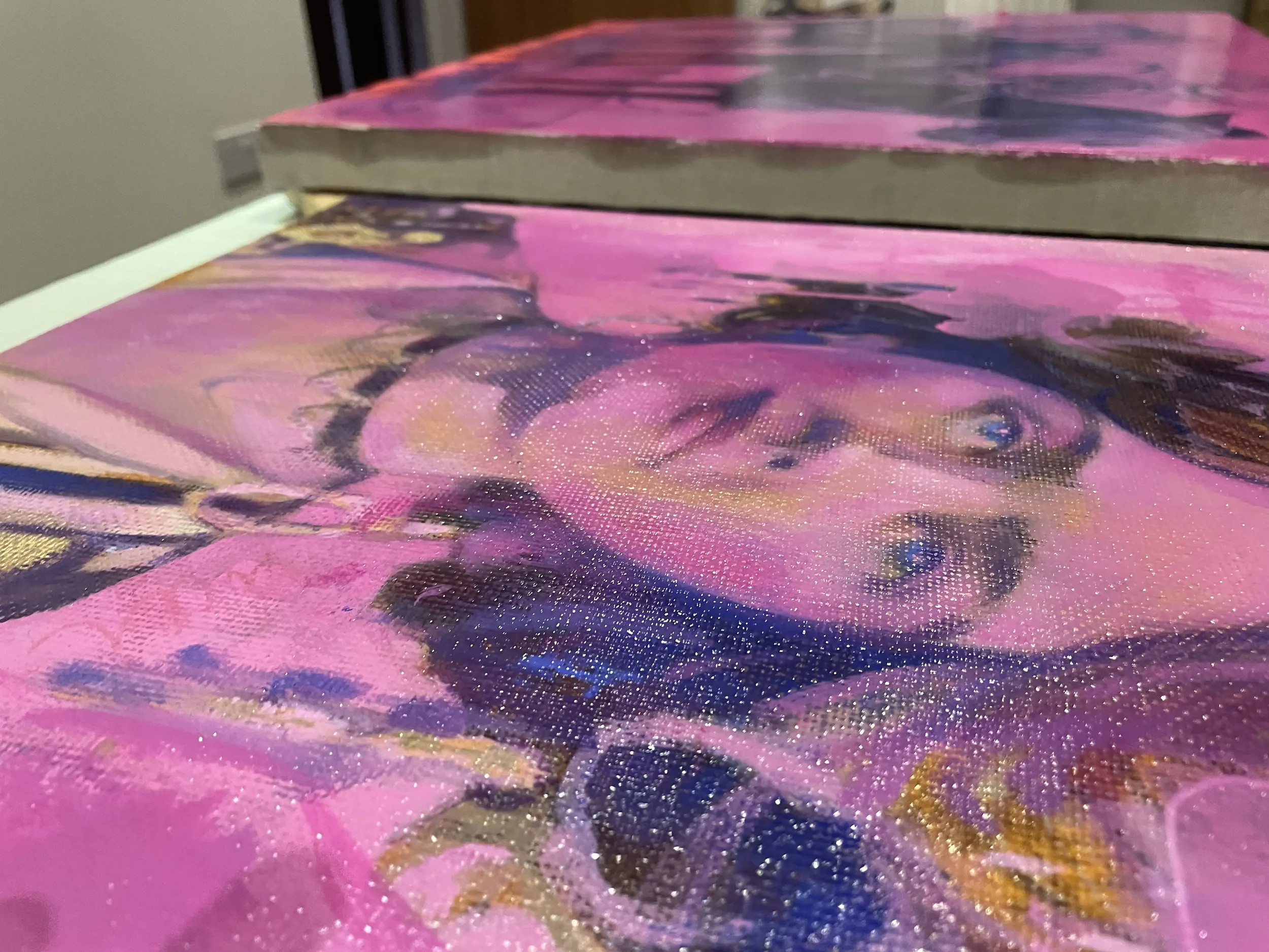
And FINALLY. No turning back, time to apply a satin varnish. Goodbye, my beautiful Miss Lily Elsie, The Merry Widow. For now at least…